Here is one more formal gallery visit critical response for my digital printing on fabric class. I'm trying to knock these out early on before I get swamped with reading and writing in my academics.
Gallery Visit #2: Perelman Building PMA, "Common Ground: Eight Philadelphia Photographers in the 1960's and 1970's" I'd originally been planning to visit and write about the Kantha exhibit (see previous post), and normally I would have walked right by a photography exhibit. However, I'm glad I entered, as hidden behind the room barriers, unseen from the entranceway were 2 photographic fiber pieces by artist
Catherine Jansen. A quick internet search revealed her
website, where she claims to be one of the first artists to use digital imaging in fine art. Both of the works in this exhibit span her early career as an emerging artist, and I was intrigued to note that she received her MFA from Tyler (where I'm currently a graduate student).

At the right side of the exhibit, her piece
"Self-Portrait" from 1971, is a cyanotype-printed image combining a photogram body print, photogrammed feathers, grid texture, grasses, and ferns, as well as 2 negative-printed self-portraits and 2 negative-printed stereogram views of Niagara Falls. Randomly placed indigo patches may cover up images or areas that didn't print well, and 2 patches that abut the main figure may even erase parts of her body, like bulges under the arm and along the back. Embroidery stitches define the frames of the stereograms, and french knots are scattered like seeds in one boxy area. However, this stitching and quilting is minimal and the work suffers for the uneven stitching as there are unintentional wrinkles and uneven surface tension.
The beauty of the piece is more in her exploration of self-portraiture rather than her craftsmanship. It is not a mere photographic representation of her features, but is a combination of elements that clue the viewer in to Jansen's emotions and personal history. The bed-like scale and laying figure coupled with the 2 negative-printed portraits showing her hands in alternate poses of choking and submission make this piece tread an uneasy balance between dreamscape and nightmare. After looking her through her website, it appears that this cyanotype bed-like imagery led her into creating an entire room reproduction in cyanotype, which fed into an entire 5-room installation from which the following piece is taken.

This diorama at the left of the gallery reveals Jansen's sculptural background. Entitled "
Tabletop Arrangement" from the "Soft House Project (Domestic Landscape)" created in 1979-1980, Jansen has photographed to scale multiple household objects, printed them on fabric via color photocopying, and reconstructed the objects in 3-dimensional stuffed forms. A floor mat, Burpee seed catalog, and Chinese slippers lay in front of a tablecloth-draped demi-table upon which are set a vase of flowers, a pair of secateurs, framed girlhood photos, an air-mail letter, a polaroid camera, and a stack of polaroid prints. Beside the table is a wastebasket filled to the brim with the packaging detritus of the polaroid picture-taking (all still printed, sewn, and stuffed objects!). Behind these is a backdrop recreating the floral wallpaper, baseboards, framed and hung photographs, and a large 6-pane window revealing a view of a fantastically fecund landscape.
While the self-portrait in cyanotype was more literal, this installation (just a small part of a 5-room installation) is showing more of the day-today life of the artist, her family, and her imagination. The things we own speak volumes about us. The intense florals, the explosive gardenscape, and the seed catalog, seed packets, secateurs, and "fresh-cut" flowers reveal her green thumb, or her desire to have one. The polaroids share her passion for photography, but also allow us a peek into her family life. The multiple views through the windows and photographs give the viewer various entry points into myriad worlds. It's an Alberti's window with pictures within pictures within pictures. Although this piece, too, lacks needlework finesse, it's easier to overlook in the installation than in the cyanotype as Jansen gives us so much more to look at. I feel as if I could look for hours and still be lost in patterns and windows and memories.
There were a lot more photographs in this exhibit, but I only had eyes for fiber.
 And here's what it looks at right now:
 All of the applique is done, so now I'm on to more detail work. I really like the rust- dyed fabric for the brick building. I'm having fun with this raw-edge/Kantha style applique. I'm making lots of new dyed fabric samples in my fiber studio class and am saving all the scraps.


 Tested the same dyes on both cotton and silk to see the differences. Tested the difference between dye mixture and overdyeing. Threw in a simple rubber band resist on the overdye below.


 This screengrab below is the image I'm basing my first digital print on fabric off of for my other studio class. We've been manipulating our sketches in photoshop and paperbacked our fabrics today. Tuesday will be the day to print!


 My 12 7 13 year-
 I was pleased with the level of concentration and engagement the kids had. I think the videos really helped- it certainly captured some of the boys' imaginations. It also helped that I allowed it to be a more free drawing/imaginative project rather than a look/draw project. I've been trying to apply some of the ideas I've been learning in my art ed program, seeing what works..
 I've got an incredible bunch of kids right now. Not that they're art stars- they're just good listeners, receptive to ideas, and willing to try things. Some of them I've known for a few months now, but most are new.
 Here are their progressions so far. They'll have a chance to refine them next week and then we'll bind them accordion-style into a book. If I can manage it I'm going to try to scan all their images and load them into a video program stop-animation-style. It'll be a challenge for me- I've never done it before but have really been wanting to try. I wonder if there's a good slide transition I could use since there are only 9 frames to work with.


 And here's a close-up of the motif, a sort of Pennsylvania Dutch inspired Heart and Tulips design with the couple's initials springing out of the design. It's mostly double running stitch with some tiny lazy daisies and french knots.
 I could not have asked for a more appropriate exhibition to put me in the frame of mind for a digital printing on fabric class. Heather Ujiie is a fiber artist who works in installations of digitally printed fabric hangings. This is the second exhibition of hers I've seen, the first being "Cry Wolf" at Moore College of Art and Design where Ujiie is a faculty member. In both exhibitions her work has had a narrative quality: "Cry Wolf" a more storybook quality and "Ninja Warrior Face-off" a more comic book quality.
 a samurai warrior at left with a death figure at his back looks as if he has just dealt a deathblow sending a flame-haired demon figure spinning off. In an attempt to recreate the sequential stills of animation she repeats the demon figure both across the main colored panels as well as in 3 transparent panels hung in front of it.
 To connect the panels in space and to amplify the impression of movement and eruption, circles of flower/mandala motifs taken from the main panels are suspended at varying heights throughout the space.
  To delineate details in the main panels, Ujiie has plied the needle, unifying the figures through color and embroidery. Decorative buttons echoing the mandala motifs are scattered across the surface.
 I brought my embroidery students down to see the installation to identify the stitches used, critique the work, and spark their ideas for a future figurative project they'll be doing. They were all wowed by the work, impressed by Ujiie's ambitious scale and use of embroidery, and they were all curious about the digital printing process. I, too, was impressed at first, but then my critical graduate student voice crept in and made me question many of the artist's decisions.
  As an embroidery artist, stitching in others' artwork is always alluring, however, I'm not a fan of large sloppy stitches. Within the digital imagery, Ujiie included some stitch-like marks, but they don't translate well in this scale to embroidery stitches. (I have the same issues when looking at Orly Cogan's work). I think the piece may have been just as good even without the embroidery and so I question its use.

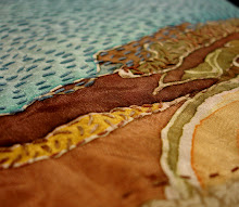
 Here it is next to its inspiration. It's a view of Palmer park from Frankford Ave. I'm trying to go for a looser interpretation than my usual. I'm deciding whether or not to put in the trees and all the rowhouse windows or not. Yeah, actually looking back over this as I edit, it's definitely not finished yet.
 While I live with that one I've started the next one. Nothing is stitched yet, just laid out the scraps and composition.
 Here's its inspiration- a rowhome remnant on York St.
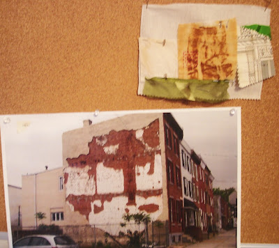 I spent my morning printing out all the articles I'm supposed to read for Human Development this semester. Also ordered the text book. So much to read, so much time I'd rather spend stitching. On the other hand tomorrow starts Digital printing on Fabric YES!!!!!
 It's like pulling teeth to get my kid to dress up in anything other than jeans and t-shirts, but I somehow convinced her that this dress was awesome and would be even better if I added some embroidery. So plain black wrap dress, although snappy, is tween-ified with the addition of a vine and owl motif. She'll be wearing it next weekend at my little sister's wedding.
 I had her look through some copyright free image books to find a motif she liked. I was all for a flowers, but she wanted a bird. So we planned the design together, she chose the colors and colored in my tracing so I'd know what to put where, and here it is. Whipped running stitch for the vine, detached chain anchored with a bullion for the leaves, encroaching satin for the body of the owl, buttonhole for wings, crowsfoot ears, eyelet and buttonhole wheel with a whipped ring for the eyes.
 GIFT SPOILER! While dress shopping I also picked up some plain napkins and a tablecloth to give as a gift. They said no gifts, but come on! She's my sister! So I found a sweet Pennsylvania Dutch-Style hearts and tulips motif, played around with it a little and added the couple's initials. This motif is for the napkins and they're all transferred and awaiting my needle and thread. There's a larger motif for the tablecloth.
 Chances I get this all done by Sunday, on top of the 3 classes I'm teaching and the 4 I'm taking that start this week? This will be a feat worthy of medals.

 After Locks, I did some retail therapy and bought myself a new winter coat so I can brave my cold bike rides to school this semester. I then made my way back to Northern Liberties and stopped in at