Pages

Showing posts with label links. Show all posts

Wednesday, July 6

Skirkanich 3

I'm sure we were given an intro to topology during our lecture week because it helps consider networks as something to be analyzed independent of physical space. To think about connections and networks in the brain, you might need to pull them out of their tightly clustered physical confines and examine them simply in terms of numbers. But the concepts of topology itself blew my mind! I'm accustomed to the middle school level of geometry and understanding the structures of cubes etc in physical space. Imagine being able to stretch apart the vertices however far necessary to just look at the structure of vertices connected by edges. The visual possibilities sparked my curiosity.

On the way home on the last day of our lectures I happened upon the overflowing dumpster outside of the School of Design. Among the discarded sculptures I found a little model of a tetradecahedron made of thin cardboard. It seemed such a perfect little model of the math ideas we'd heard about over the week. I was reminded of Joseph Kosuth's One and Three Chairs piece, and so I painted the cardboard form in a complementary gradation, painted a geometric version of it unfolded, painted a topological version of it stretched out, and painted its definition. They are all visualizations of the same object. They all represent a tetradecahedron (or cuboctahedron). Which version would allow someone to understand the object best? Do you need to know what something is in physical space? Would a definition provide enough information? If you saw it topologically would you make the jump to geometry easily?
I think where I am going with this is that this is why we are involved in this internship at Penn. There is more than one way to understand information- and maybe you can't fully comprehend a science until you look at the information backwards, forwards, flattened, stretched, and insideout.

Saturday, December 28

Noyes and Forsythe

So nice to escape the city for a day, and actually get out and do something during this vacation time (although the studio has seen a bit more of me than usual this week). We drove down to Absecon to visit the Noyes museum, which is this great little art museum that features New Jersey artists primarily. They have four main gallery spaces. One is featuring a solo exhibit of fable-inspired portraits by Victor Grasso- while well-painted, some were just annoyingly... well see for yourself. Another gallery had a member show, and a third had an exhibit of impressionistic pastels by John Pierce Barnes. In the hall was a great window installation by Karen Guancione, filled with suspended card catalog cards- all these once-useful indexes flown to the wind.
 A final gallery had an exhibit about Noise (noise- Noyes, get it?- yeah it's a little silly, but it was perfect because my daughter asked on the way down- will it be noisy there? Oh we love a little pun....) I'm not a huge fan of multi-media art exhibits because half the time the media devices aren't working, and they weren't. There were headphones connected to a typewriter and an old trestle sewing machine, but no sound came out, and an ipod was dangling from a phonograph-like sculpture, but no sound poured forth because the cord was disconnected. And were these sculptures meant to be interactive or not? No signage granted permission, but the works seemed intended to be interactive. I love the Noyes, but this exhibit seemed sadly neglected. Despite the media flaws, there was an INCREDIBLE piece by Eve Ingalls anchoring the show. From afar it appeared like a charcoal drawing:
but up close it revealed its incredible 3 dimensionality. Entitled "After Sandy", it embodied the crash and thrum of pounding waves and the crunch of sand covered asphalt, all while sitting quietly on the wall. Perhaps its success was that it did not set out to make sound or incorporate sound literally, unlike the rest of the works in the show. It was a great noise through visual expression  and interpretation. Visual artists can get in trouble when they try too hard to be something more than visual. Ingalls captured it just right. Check out more of her incredible work.
 Is it any surprise that my favorite works were fibers-related?
 Much to my surprise, the Forsythe national wildlife refuge was RIGHT NEXT to the Noyes (who needs gps?) and our adventure continued to the great outdoors. It seems more of a vehicle-friendly place than walker-friendly (ugh... NJ car culture), but we took a short hike down to gull tower pond and climbed the observation tower. I took some panoramas and sketched from the close-up views of the swans and egrets you could see with a telescope up top. The sun-spot above obliterates the Atlantic City skyline with its windmills. I love windmills. From the aerial view, the wildlife seemed so much more abundant than from our roadside hike vantage.
 Although, we were wonderfully startled by an egret who suddenly leapt from his hiding place about 10 feet away from us as we walked. I love the marsh grasses and their reflections. The broken stalks below remind me of a Harry Callahan photo. I wish I could stumble in and weave a living basket of them.
Winter color is subtle.Winter light is crisp. I'm more inspired by the beauty of nature than the man-made beauty in the museum. I can't help myself but to go and make art myself... but it is a poor reflection of the wonder of the world.

Sunday, April 7

Unusual threads

It was First Friday! It was Spring! There was finally art worth seeing and weather worth going out in to see it! Unfortunately I forgot my camera. But there were two great sights in Fishtown on Friday night. Firstly, Holiday Campanella showed off her felted "Fleisher" at Philadelphia Sculpture Gym, capturing two of my loves (fibers and my favorite community art center). Secondly, Jason Hackenwerth had an installation/environment at 2424 York that was magical. With light plastic sheeting, clear packing tape, and fans, he created a series of tunnels, domes, and cave-like spaces to move through. The air pressure as the doors to the space opened and closed would dramatically alter the inflation and movement of the plastic structures. It reminded me of the rare occasions the gym teacher would let us play with the parachute and you could run underneath the puffed up cloth and be enclosed.

The next night brought a new adventure out to West Philly to Seeds Gallery to see a collaborative show including Genevieve Coutroubis, Johanna Marshall, and John Karpinski. Genevieve's photos of Greece were the playground for John and Johanna to explore. John's drawings captured the magic of childhood and Johanna's stitchery added nostalgia for the past. 
 I especially loved this scrollwork over the strap on the statue's shoulder:
Seeing these stitched photos makes me want to play some more with stitching on paper. Maybe if I printed out some of the panoramas I've been doing lately. Fabric is more fun to stitch on though. Maybe I could do some digital prints on cotton or silk..... Seeing art makes my mind spin.

I figured out that in my hour and a half in the studio today I was able to stitch about 60 stitches a row, each row was about 2 feet... there were 12 rows making my total for the day about 24 feet of thread and about 720 stitches. I'm hoping for more time tomorrow so I can get a section of my wall piece totally finished.

Friday, August 3

A School of Fish

 Today my daughter and I went to one of my favorite places in Philadelphia- the Wagner Free Institute of Science. It's a natural history museum that was founded in the Victorian era, and which has retained its original design and layout of specimens for over 100 years. It's like stepping back into time, and yet also absolutely timeless and relevant.
 Specimens range from minerals, insects, fossils, crustaceans, various sea life, reptiles, birds, and mammals. Some are taxidermied, some are skeletal. All are a visual feast for an artist like me. Today I focused on drawing fish, as I have a glimmer of an idea for a bulletin board I want to  do for my art room to kick off the year. It's the best place to find things to draw!
I miss drawing. I'm pretty good at it, but I feel a little rusty. It's funny seeing these 3 pictures together all about the same size and proportion. In actuality the top fish is a 6.5 foot long Tarpon that's about as big as me, the middle porcupine fish is about 15 inches in diameter, and the little trunkfish at the bottom are only about 5 inches long!

The Wagner has education programs during the school year for classes that want a field trip. I actually like it better than taking kids to the Academy of Natural Sciences because it's just full of specimens and has very little text around. At the Academy the experience is very directed and there's a lot of information to read. There's something wonderful about just having access to their incredible collection with minimal direction- it fosters curiosity and exploration.

Wednesday, April 4

Art Quilt Elements 2012

I avoided opening night of Art Quilt Elements 2012 knowing I'd much rather be there when I could have unfettered views of the beautiful work. So I went the day after it opened instead!  Overall, it's a good show, but I wasn't as blown away as I was for the 2010 exhibition. Of course, that may just be that I'm more familiar with many of the artists. This year's selection seemed to have fewer artists exploring surface design or stitching, and more hearkening back to quilt traditions. The following works were the stars of the show in my book, for their interesting structures, use of color, and interpretation of quilt arts. 
 Eileen Lauterborn's "Climate Change" graces the postcard and catalog cover, and it's easy to see why: there is an explosion of color and intriguing textural technique. There are layers and layers of thin strips of cloth overlapped and zigzagged. Normally I'm a diehard for hand-stitching, but the machine stitched zigzagging echoes the movement of the strips for a perfect marriage of form and function. The complex surface sucks you in, and you are lost in the labyrinth of lines.

 Marianne R. Williamson's quilt was another piece with lush surface color and texture. She layers raw edge scraps and densely stitches them down in free-motion stitching so that the fabric almost looks felted. Her color is gorgeous with an impressionistic effect.
 One of my real favorites in Art Quilt Elements is Betty Busby's "Organelle". Her quilting stitches were really like an intricate drawing of the enlarged microscopic view.
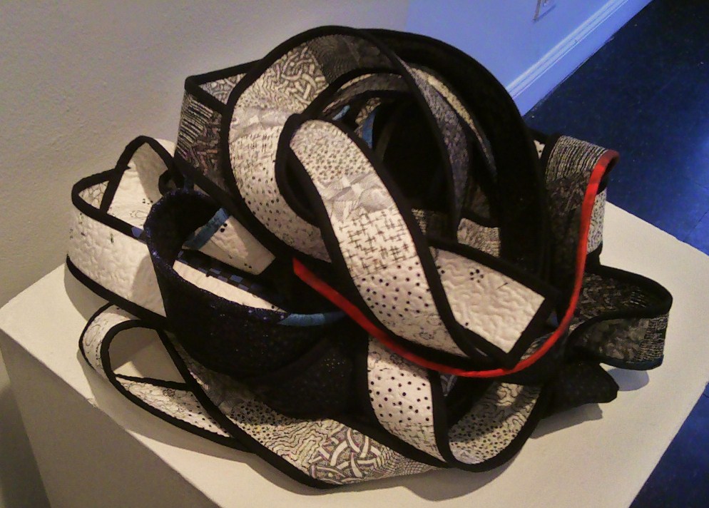
 Across the gallery from Busby's organic piece was Beth Barron's "Implosion":
 From afar I was fascinated by the unusual form and jagged edge. Up close there's an "EEW!" factor- the entire piece is made of FOUND bandaids appliqued to the cloth surface. I really don't want to think about the sanitary issues of working on something like this, but the resulting wound-like piece is incredible. There's no bandaid to cover up a wound that big.
 One artist utilizes the traditions of quiltmaking, but brings them to new heights by combining and juxtaposing myriad piecing patterns. Mary Shell's "Colors Unfurled AKA if Betsy Ross had my Stash"  combines quilt arts with Jasper Johns, with a separate quilt pattern to represent each stripe and a starburst for each state.
 Commercial fabrics were pretty common this year, but none so transformed as by Shawn P. Quinlan:
 Motifs from various commercial fabrics were appliqued to create a narrative composition of commercialism gone haywire. Careful, baby, there's sharks in the water, and the toy store's on fire!
 I enjoyed Mary Ruth Smith's piece, below, for it's emphasis on stitching, and I really like her layering of transparent cloth over digitally printed images and perhaps even paper. I'd love to be a fly on her studio wall sometime. But technique aside, she uses  newspaper clippings- text, crossword and sudoku puzzles, comics, and story illustrations, which show the onslaught of media information we must filter through. I much preferred her subtle comment on media and current events over a nearby piece with the words "War sucks" emblazoned over the cloth.
 Newspaper and media references continued in Jette Clover's typographic exploration (left below).
 I most enjoy the technical virtuosity of work like Ilene Pearlman's (right above) which combined reverse applique and trapped found objects o create a dream-like atmosphere, and the unusual format of Brooke Atherton's "I feel free" (below).
 As I've recently been stitching on found garments, I enjoyed seeing the yellow blouse stitched into the quilt- apparently it was something worn to  friend's wedding. With the marriage no longer in existence the cloth's memory is tarnished, so it has been repurposed- it practically flaps away in the internal wind of the piece.
Art Quilt Elements 2012 is on exhibit at the Wayne Art Center through May 13th, and is well worth the trip.

Fiber Philadelphia isn't over yet!!
This Friday, April 6th, several shows are opening in Old City, including "Strings and Things" at 3rd Street Gallery with Melissa Madonni Haims, and the 2nd part of "Stitch Witchery" with Melissa, myself, Rachel Udell, and the late Maggie Brosnan at the Painted Bride as part of Inliquid. Come out to First Friday from about 6-8 to see it in person!
The following Friday, April 13th from 6-8 will be the reception for "Softer Edges" at the Works on Paper building at Fleisher Art Memorial. Hope to see you there!

Sunday, April 1

Synchronicity and other things

I've been to 8 different galleries in the last 3 days to catch up on Fiber Philadelphia! After an afternoon out to the Wayne Art Center (more on that later), I happened to drive by Highwire gallery and saw an opening in progress. The aptly named "Synchronicity"  boasts work by Melissa Madonni Haims (with whom I'm showing at Nichols Berg Gallery last month and the Painted Bride this month) and Natalya Aikens (whom I invited to exhibit in "Softer Edges" at Fleisher this month). There is some great art quilt-based work in the show, making it feel like an extension of the wonderful work in Art Quilt Elements out in Wayne.
 Natalya Aikens "St Petersburg Lace" has the bold graphic quality of the wrought iron fencework that inspired her, but also a rich and mysterious surface of layered color and texture in the surface.
Jill Rumoshosky Werner has several works in the show which take art quilts into sculptural forms- often with a humorous take in a series that illustrates specific verbs. Her piece above, "Grieve" reminded me of the piece I'm trying to do for the Cathedral- long, thin, mostly black and white. She makes subtle transitions between all the various patterns, a study in black and white pattern. The small line of red and blue along the binding relieves the austerity.
 Jette Clover has twin pieces exploring text and texture in monochromes, with a pop of red here and there. Seeing text makes one want to decipher it, but these remain coded. What I was excited about was to see works incorporating screenprinting in art quilts. Many fiber artists are jumping over to digital printing for more technological experiments, or shifting back to slower hand-dyeing, rusting, and compost dyeing. I hope to show these to my screenprinting students next semester. If you missed the artist reception, then come out to the First Friday event next week!
 From Fishtown, I hopped up Frankford Ave to Port Richmond to see the "Paper Fortress" show at Pterodactyl. It's too bad this show is hidden away in Port Richmond, as it is one of the best exhibits I've seen in the last month but not many people are likely to venture out. There were intriguing parallels between the fiber and the paper/book world. Both genres have a tentative place within "Fine Arts", but it allows paper and fiber artists room to explore without caring too much about what's "right".
 Karen Hardy's piece is like applique, with couched sheets of dyed paper on  a larger sheet of plain handmade paper. Raw edges in paper seem so fresh- raw edges in fabric usually feel unfinished.
 Alexis Granwell had several pieces. I liked her map-like etching on the mottled paper. The little dot could have been french knots. (check out the first page of her website for a view of the plate for this piece!)
 She also had a sculptural piece using found materials which echoes the map structure of her etching. It also reminded me of all the half-built constructions one sees around the city. There are complex bones under our structures that we take for granted and trust, all relying on the engineering and skill of the builder.
 I think my favorite work in the show was Lisa Murch's sculptural formations. From afar, this piece looks like a wasp's nest, an organic encrustation over the wall.
 Up close, one sees that it is made of sewn-together  cardboard egg cartons. I love transformations of everyday objects, and I also appreciate the massive time that went into making something like this.
Finally, I was pleased to see Book Bombs (with Mary Tasillo and Michelle Wilson) had another take-away zine, "Horizontalidad", one of which was attached to a paper-cut out bench made of invasive plant fibers. It was a satisfying combination of street intervention art brought into the gallery environment, but encouraged viewers to take it a step further by adding their own story. Sorry no picture, but visit the book bombs site for more info.

So, Fiber Philadelphia continues into April. I'll have more on Art Quilt Elements in another post, and news about "Softer Edges" soon as well. I hope people take time to get out to all these great shows this month!

Saturday, February 25

Not a Stitch

Next week I'm installing a piece at B Square Gallery for the "Not a Stitch" exhibit which will open on Friday, March 2nd. I was very honored to be asked to participate as it's in one of my favorite galleries (run by a fellow Moore Alum!), and has an  interesting international selection of artists involved.

But what does a fiber artist whose main occupation is STITCHING do that has NOT A STITCH in it!? My very first thought was to do something with pricked paper (I could at least use a needle that way), but wasn't sure what the imagery should be. Then I thought about printing an embroidery pattern:
This was a scan of an actual embroidery I did that I intended to screenprint onto fabric or paper as motifs or in repeat. However, I got a sneak peak at another artist's submission that was inspired by crocheted doilies, and then thought this one would be too similar and not nearly as interesting. So I hemmed and hawed some more.
The reason I wanted to do the sampler piece originally was because I often use this style of sampler in the classes I teach. It's an easy format where each new stitch becomes a ring in a mandala. Samplers are the traditional way for people to learn embroidery for the first time, and many people follow a pattern for where to place stitches.
 I have a love/hate relationship with embroidery patterns. On the one hand, having a pattern encourages the novice stitcher to try a new medium and become proficient with the guarantee that the finished product will be satisfactory. Patterns introduce new stitchers into the world of embroidery, but they don't really encourage creativity. I've written about some of my embroidery research on this blog before, and can affirm that embroidery patterns have been around for centuries. Once printmaking presses were invented, commercially distributed patterns became widespread. Patterns such as the ones assembled below, published by Gilbers in 1527, can be seen in countless historic samplers.

From 1527 all the way into the early 1800's, these border patterns varied very little, showing how times haven't changed much in the DIY embroidery field. But I don't understand this widespread reliance on patterns. With some tracing or carbon paper one can turn any sketch, image, or photograph into an embroidery. When I teach, I try to encourage students to design their own images and experiment with fabrics and stitches to best interpret their ideas.
Sooo.... Not a Stitch, not a single stitch. These ideas of tradition and process and creativity have been bouncing around my head. Finally, it came to me to go back to that original idea of pricked paper-for that is a functional part of the embroidery process for transferring patterns to fabric. Our stitching ancestors didn't have our fancy fading marking pens and iron-on transfer paper or even carbon paper. Pricking and pouncing is a technique that has been used in many design fields for centuries to transfer images to another surface.
I decided to use one of the ubiquitous border patterns used in so many samplers in the past as inspiration for a pricked and pounced design. I enlarged this pattern from the original 2-inch high pattern to a 20 inch high design,  making it larger than life. I used a pushpin instead of a needle to prick the pattern into vellum (it was easier on my fingers that way). When I install, I hope to pounce the pattern directly on the wall and hang the vellum on the wall, perhaps with the prickly backside turned towards the front to catch the light and emphasize the texture.
This has been an adventure, but it's really good to get pushed out of my comfort zone once in a while, and work my own creativity muscle.

Friday, January 13

Playing with pictures

I am the screengrab queen. No photoshop, just the crappy paint program, and some screengrabs from my good friend g o o g l e. I have 2 pieces that are panoramic "drawings" in thread of views of the city, and I'm wondering if I can whip out one more before February and my solo show arrives.
 I would use these photo collages to create a line drawing to transfer to fabric. they're views of 2 places I've lived. I think the streetviews are funny time capsules. I don't know how often they are updated, but not very. Sometimes the streetviews are a shock- like the empty lot on the right in the picture above used to be a boarded -up building that gave you chills to walk by. In the picture below there should be a whole new building mid-right.
I've always loved panoramic photos. When I was a teenager I had a "panoramic camera"- it had a lens that just cropped the standard photo format to a slice. Although it might have had a slightly fish-eyed lens... I forget. I loved the pinhole cameras made out of oatmeal boxes we'd use in my first photo class. The paper bent around the back of the canister would create great distortions of perspective but in incredibly sharp focus. I also have a series of family photos in vacation spots made much like my collages above- but with one of us standing on one side of the photo, then a quick photographer switch for the other to stand in the opposite side of the photo. (I really don't like handing my camera over to strangers). One of my favorite photographers was Art Sinsabaugh who took amazing panoramas of the midwest and Chicago with one of those cameras that was meant for taking long group photos. Come to think of it, my grandparents had one of those panoramic graduation photos hanging over the "davenport" (as they called the sofa). I think this love for panorama might go back farther than I realized....

This whole streetview thing is a little creepy. But I think I might be on to something that I want to work on.

Sunday, December 25

Merry Christmas!

 We save decorations for Christmas Eve- It makes it more special I think when it's not up for a whole month. I have a tiny tabletop tree and I let my daughter pick out the ornaments this year- many of them are handmade from years past.
 The windows are covered in snowflakes (my mother cut and laminated- the images in them tell the Jesse tree story) and some bright Waldorf stars made of origami paper. I got the pattern here.
 We made some origami garlands too. My daughter folded 24 paper cranes and I made a string of stars. The black and grey star is not a waldorf one, but the end-product looks similar. I like garlands- they really make things look festive.
 One of the presents I received this morning was a Frido Kahlo finger puppet my daughter thought I should have. It was made by Abbey Christine and can be found on Etsy if you need your own. She wasn't sure if I'd like it, but I think things like this are great gifts for art teachers! I can't wait till I have an opportunity to use it with some kids.
My creative forces are being directed towards the kitchen now- I'm the official dessert baker for family dinners. I think this is my 99th post of the year. I'll make one more sometime this week to make an even 100 for 2011.
I hope everyone is enjoying the holiday, making things and spending time with friends and family.

Sunday, December 11

Quaker Medallion

Last year I wrote a paper about Quaker schoolgirl needlework for my History of Art Education course. My professor mentioned recently how much she enjoyed that particular topic, (perhaps wondering why I didn't expand on it for my thesis) so I decided to make a little medallion for her as a parting gift. All my grades are in and I'll be officially granted my Master's degree in January! Goodbye Academia!

Anyway, back to the medallion.
Medallions like these show up in the samplers from the Ackworth Friends School in England. As 18th-19th century Friends were quite the travelers, these designs spread quickly among Quaker schools from England to America. The ornate medallions may seem to contradict the "plain-ness" expected of Quaker needlework, but their monochrome colors still make them acceptable. They are often seen as half-medallions around the border of a sampler, but the half-medallions are easily adapted into a full circle.
 I generally dislike doing cross-stitch, but it was kind of fun to follow this radial design. I really only used the pattern for the first quarter, and then just copied the quadrants. I used the pdf pattern available on Needleprint, a wonderful resource for Quaker schoolgirl designs. I left out some of the doodads in the pattern and used the remaining negative space for a monogram. With only the botom part filled in it has taken on a slightly heart-shape! I used a slightly variegated red/red-violet DMC thread for some subtle color shift that makes it look a bit older or more handmade, on a tan aida cloth for an antique look. I expect to turn it into a little stuffed ornament- now if only I had a bit of red and white toile for the back- it would be perfect.
This kind of monochrome stitching makes me want to get back into some blackwork....

Saturday, December 10

Art and about

Normally I'm teaching on all the official opening nights around town, but since we have a bit of a break now, I was able to make it out this past Thursday night for "Second Thursdays" at the Crane building. It was a perfect night out with my family (they found quite a bit of amusement along the way while I checked out the art). It was also a great surprise to see art by some friends plus a huge exhibit of children's artwork!
 Printmaker Rebecca Gilbert was showing work in the Inliquid hall. I first fell in love with Rebecca's work when she was showing at Nexus a few years ago, and I own a small woodblock print of hers. These blew me away, though, because her woodblock technique has become so refined as to give them the appearance of soft watercolors. Most of these prints, she said had around 12 layers- her color gradations are therefore so subtle that the edges of the reductions are almost imperceptible! Another formal aspect  I enjoyed was the use of shadowboxes and cut layers of prints to create a relief image. It echoes her process of carving into the wood to make the prints, and then carving up the prints again to prove the layers. Her larger pieces were cut out and mounted on foamcore, which gives them a more demanding presence than if they had remained confined inside their paper boundaries.
 The panning image, below, was especially impressive.  I enjoyed her concepts, too. The imagery included panning for gold, coins, mud pies with buried treasure, and a child building an intricate worm house. To me it spoke of creativity, innocence, and wishful thinking, but also a kind of naivete about how money is made or life is sustained.
 In the University of Delaware Gallery there was a group show entitled "Decadence". I was pleasantly surprised to find the work of Pazia Mannella, a former fibers instructor of mine at Tyler. She had one of her zipper pieces upstairs, but downstairs was an installation in shocking fluorescent pink.
One first sees a curtain of crocheted plastic spilling onto the floor. The irregularity of the netting reminds me of camouflage, but the color screams for attention. The color and the inclusion of a few plastic hair barrettes in equally bright colors have a girliness to them. Behind the curtain there was a wall piece of crocheted plastic encrusted with the hair barrettes. I preferred the density of the barrettes on the wall pieces over the random addition of barrettes on the curtain, for when amassed they transform from object into texture. This kind of hair barrette are found in litter all over the city- they snap open quite easily. They remind me of certain students I've had with their hair plaited into hundreds of braids, each with one of these barrettes on the ends making music as they walk or turn their heads. 
 They create a fascinating texture together. I'm reminded of Sonya Clark's use of haircombs. I'm excited to see some new everyday materials in Pazia's work, and I wonder what she'll incorporate next.
 Also in the exhibit was a pedestal covered in cake plates and cloches. Upon each was a beautiful "cake" made of fire crackers by Timothy Belknap , another instance of the transformation of the ordinary into the extraordinary. I'm reminded of birthday candles that can't be blown out, as well as the "can't have your cake and eat it too" analogy. We can have the beautifully constructed cake or we could have a sizzling display.
 The Ice Box  and Gray space were taken over by the Mural Arts Program Artists-in-residence and their student work. It took a moment to understand that the work in the Ice Box was indeed children's artwork. Many children's art exhibitions try to jam as much of each student's artwork in at once so everyone is represented. This was installed more like a gallery installation of professional artists- very well-edited. The dynamic installations show the power of collaboration and creativity that can occur in a residency.
 The "ransom note" above was about 8 x10 feet big. I wonder if it was done on parachute cloth and we're seeing it before its final installation on site. I was excited by all the variety of color, pattern, and typography in it.
 These 2 pieces reminded me SO MUCH of the "weight of the world" project I did with my high school kids last spring- object drawings in charcoal and figures collaged together! They're amazing. I want to go back and look some more at the individual drawings.
 My favorite piece by one of the residency artists was this one by Marcus Balum. This was the piece I saw that made me want to go home and WORK. It's the scale I want to be working at. It's cityscape. It's exactly what I needed to see that night.

The opening reception for the Mural Arts exhibit will actually be next Thursday, December 15th. I highly recommend going to see it.

It's so great to be going out to see art again! Now that my thesis is finished and grad school is coming to a close I feel so free to work on my own stuff, see friends again, and get out and about. It's wonderful!