Pages

Showing posts with label landscape.. Show all posts

Friday, December 30

Thinking out loud

Only one more Daily Notes strip is needed to complete my year of stitching. I need to lay them all out and see what 2016 looked like. Each week I also sewed the scraps together into a larger quilt-top- very randomly. I've done some nui-shibori on it and overdyed it in indigo, and the piece is already being stitched up with imagery related tot he brain and perception. I'm hoping to finish and display it with the Skirkanich work I did over the summer at the exhibit we'll have at Westttown School in March.

That leaves me wondering about next year. I really enjoyed having an "assignment" for myself to work on each week. Although by the time August came it started dragging, I rallied through the Fall to finish strong. It's strange how over the summer, when I have all the time in the world I work less than during the school year when I'm busy beyond measure. 
I've been debating about a project for 2017. I don't want to continue the daily note strips. I want to start something different. The weekly format fit well with my schedule, but the size of the weekly piece must remain small enough to complete in a week.
 I liked the photo collages I made last spring, but the collaborative aspect collapsed. I think I could keep up with a photo a day or at least a few a week. These are 2 versions of a photo collage layering up, filtering, and thresholding images I took this past week during a trip to Quebec. The threshold effect loses some of the imagery, abstracting it a bit. I could print the images on fabric and then stitch over them. I could screenprint them...
 I saw an interesting exhibit at the Musee National des Beaux Arts du Quebec by Diane Morin. Rows of model trees were set up in front of strips of LED lights which projected the shadows of the trees onto a large screen. As the light program strobed sequences of light combinations across the rows, the shadows flickered and shifted, like watching stop motion videos of plants growing or like watching trees fly by your car window on a foggy day. It was entrancing.. she called it "Machines a Reduire le Temps" or Machines for compressing time.
Also at the MNBAQ I saw a retrospective of Pierre Bonnard, whose color sense I have always loved. There were several snapshots in a case, some of which were everyday scenes of people in his life, and others looked like visual sketches working out painting compositions. There were several self-portraits I'd never seen before. He seems to always put his face in shadows so you can't really see his eyes.
Maybe I should do some more self-portraits. It's a way of freezing time. We change so much as we get older. My inside vision of myself and my outward appearance don't really match anymore. My daily notes project started with thinking about each day as a pixel of the bigger picture of life. The final view of all the strips should reveal how my year really was. Perception as a concept is something I'd like to keep exploring...
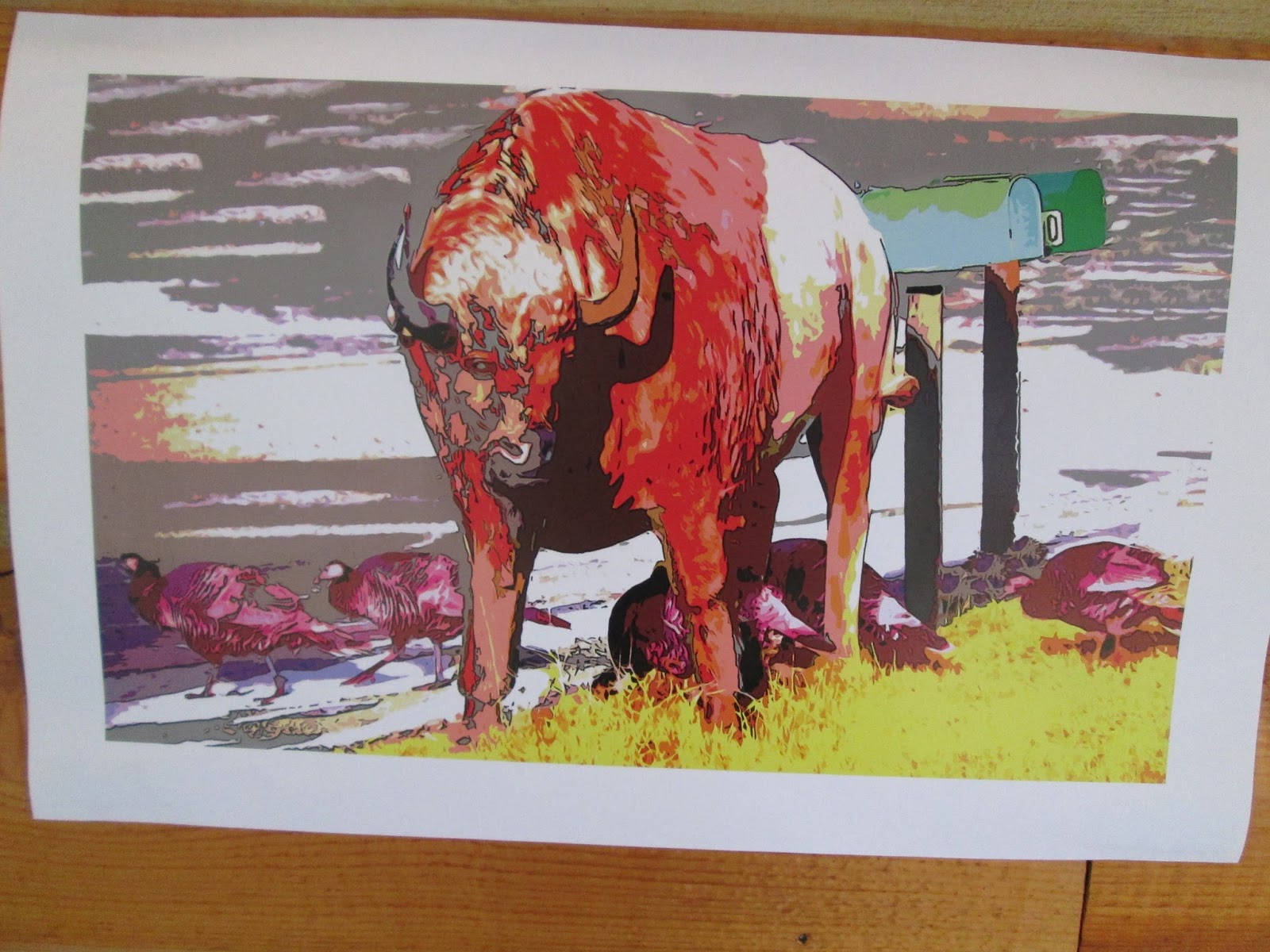
Another idea I had was to do something called "The Sky is Falling". All the news every day seems to cause a doomsday feeling. I'm worried all the time. If so many terrible things can happen everywhere all the time, what is there to stop it from happening here? But maybe it's just the media playing Chicken Little with me. Art is cathartic. So a thought I had was to screen a picture like this of the sky and stitch my worries or concerns each week- images? words? fragments? a piece of sky falling. Maybe I could print  it large and cut off fragments...


I don't know yet... 
I will finish my last daily notes strip tomorrow.
I'll take photos this next week.
I'll think some more.


Tuesday, July 1

Welcome/Summer

 What have I been doing since February when last I posted? This monstrous big embroidery on digitally printed fabric. Entitled "Welcome", it is a blend of 2 photos taken from Fleisher Art Memorial: the sunset street scene superimposed with the Samuel Yellin gates to the sanctuary. I stitched the outlines of the gate pattern in backstitch and running stitch. The light shining through the trees are thousands of french knots in variegated perle cotton. I got the image digitally printed by Spoonflower.Believe it or not, it started off as a cell phone picture. It was a bit blurry, but that's where the stitching came in to make things crisper, leaving the background with an almost watercolor effect.
 The piece was stretched on stretcher bars and framed.It's now hanging in te gallery at Fleisher for the annual faculty show. The reception will be Friday, July 18th from 6-8.
 School is out. I have no summer plans. Just taking each day as it comes. Today was hammock-swinging, dappled light from treetops, and cloud-watching.
Oh.. and getting ready to move, preparing new exemplars for an upcoming Basic Design course, and other general busy-ness. I can't totally relax all day.
I'll try to post more often...

Saturday, December 28

Noyes and Forsythe

So nice to escape the city for a day, and actually get out and do something during this vacation time (although the studio has seen a bit more of me than usual this week). We drove down to Absecon to visit the Noyes museum, which is this great little art museum that features New Jersey artists primarily. They have four main gallery spaces. One is featuring a solo exhibit of fable-inspired portraits by Victor Grasso- while well-painted, some were just annoyingly... well see for yourself. Another gallery had a member show, and a third had an exhibit of impressionistic pastels by John Pierce Barnes. In the hall was a great window installation by Karen Guancione, filled with suspended card catalog cards- all these once-useful indexes flown to the wind.
 A final gallery had an exhibit about Noise (noise- Noyes, get it?- yeah it's a little silly, but it was perfect because my daughter asked on the way down- will it be noisy there? Oh we love a little pun....) I'm not a huge fan of multi-media art exhibits because half the time the media devices aren't working, and they weren't. There were headphones connected to a typewriter and an old trestle sewing machine, but no sound came out, and an ipod was dangling from a phonograph-like sculpture, but no sound poured forth because the cord was disconnected. And were these sculptures meant to be interactive or not? No signage granted permission, but the works seemed intended to be interactive. I love the Noyes, but this exhibit seemed sadly neglected. Despite the media flaws, there was an INCREDIBLE piece by Eve Ingalls anchoring the show. From afar it appeared like a charcoal drawing:
but up close it revealed its incredible 3 dimensionality. Entitled "After Sandy", it embodied the crash and thrum of pounding waves and the crunch of sand covered asphalt, all while sitting quietly on the wall. Perhaps its success was that it did not set out to make sound or incorporate sound literally, unlike the rest of the works in the show. It was a great noise through visual expression  and interpretation. Visual artists can get in trouble when they try too hard to be something more than visual. Ingalls captured it just right. Check out more of her incredible work.
 Is it any surprise that my favorite works were fibers-related?
 Much to my surprise, the Forsythe national wildlife refuge was RIGHT NEXT to the Noyes (who needs gps?) and our adventure continued to the great outdoors. It seems more of a vehicle-friendly place than walker-friendly (ugh... NJ car culture), but we took a short hike down to gull tower pond and climbed the observation tower. I took some panoramas and sketched from the close-up views of the swans and egrets you could see with a telescope up top. The sun-spot above obliterates the Atlantic City skyline with its windmills. I love windmills. From the aerial view, the wildlife seemed so much more abundant than from our roadside hike vantage.
 Although, we were wonderfully startled by an egret who suddenly leapt from his hiding place about 10 feet away from us as we walked. I love the marsh grasses and their reflections. The broken stalks below remind me of a Harry Callahan photo. I wish I could stumble in and weave a living basket of them.
Winter color is subtle.Winter light is crisp. I'm more inspired by the beauty of nature than the man-made beauty in the museum. I can't help myself but to go and make art myself... but it is a poor reflection of the wonder of the world.

Monday, August 12

A week of workshops

I arrived back home and then jumped right into teaching a week of Stitch and Surface summer intensive. I had a lovely group of ladies, including some familiar faces and some fellow elementary art teachers, so we had a great time learning and chatting. Sadly I didn't take a single picture!! However, I can share the samples I made instead. we started off with an easy symbolic stitch sampler, experimenting with new stitches on a personalized shape. We did a smattering of shibori experiments including pole wrapping and clamping. We tried gel medium photo transfer on fabric. And we created a 4x6 fabric postcard using a variety of the fabrics that had been created over the week.
I'm not a big fan of adhesives in fiber art. However, I knew a number of the students were collage and mixed media afficionados, so we tried gel transfers to create a photographic image on fabric. The trick is to paint a layer or 2 of acrylic medium onto a color photocopy and press and smooth it onto fabric just after painting out the last layer. We let them dry overnight, and then dampened and scrubbed off the paper to reveal the image adhered to the fabric. This technique does reverse images, so text is reversed, but I kind of like how that altered my graffiti transfer above. I think this technique would work better on a wood surface. However, it was interesting to have a different surface to work on in stitch. In fact, I may do more fabric postcards using the transfer technique..
 My fabric postcard was inspired by my Montana trip, of course. I used my arashi shibori sample as a background layer and then showed everyone how to use fusible web with fabric scraps to design a composition. Finally I embellished the surface with some straight stitches, feather stitch, buttonhole, and satin stitch. I was planning to put in "O Montana" in the sky, but the O looked so much like a moon, which made the sky look like aurora borealis, that I just left it. Finally I demonstrated how to bind the edges with some double folded bias tape, which framed it quite nicely.

Although this fabric postcard could probably be sent as is through the mail, I decided to protect it with a custom-made envelope cut from a brown paper bag. It's headed back to Montana as a thank you!

Sunday, August 11

Creativity in the woods

I've been home for a week (somehow this week flew by in comparison with the week before). I thought I'd look back on the artwork made by myself and the other participants at the residency in Montana. It seems far away now, but I'm still feeling the restfulness that grew while I was there.
Tobacco Road Studios was a great location with 2 studio spaces in the garage, and a wrap-around porch where I made my workspace. Our hostess was working on an elemental series and cut a huge spiral in the lawn for "earth". The elements and trees around the property were inspiration for many of us.
 I noticed how most of the trees grew in clusters,like families. their root systems are shallow because the bedrock is so close to the surface, and the interlocking of the roots help the trees support each other. A great deal of underbrush has been cleared out of the surrounding woods over the past few years. I noted numerous stumps dotting the landscape and thought it would be interesting to take prints from them.
Woodblock printing with ink and a brayer was a total failure as it picked up only the sawmarks instead of the beautiful rings. So I switched to oil pastel rubbings to capture the texture and age of about 8 stumps. After heat setting the pastel I experimented with walnut ink on a few, but didn't like the loss of contrast.
 The 2 small stumps with walnut ink were appliqued to some red sunprinted cloth I'd made in grad school. I stitched a few rings and used feather stitch for roots reaching out and entangling. It needed a little something extra, so I added  a ring of red seeded "fire". Wildfire is a major concern in the Rockies in midsummer. The firetruck came out at one point because someone noted smoke from our (well-tended) campfire! But fire is needed at times to control undergrowth and bring new life to the forest floor as well. I finished this 12-inch piece up in a day and then moved on to a larger piece.
 I waited for a full sunny day and painted out a yard and a half of cotton with blue, ochre, and emerald setacolor. I laid plant material I'd found on the forest floor on top and let the fabric dry in the sun for a lovely organic sunprint. Five more stump prints were appliqued onto this 4x5 foot background, and then I spent 3 straight days doing concentric circles in running stitch until my fingertips ached.
 On our last night we had an open house despite rainy weather. All our artwork was hung and displayed around the porch. The event was publicized in the local paper and we had a number of adventurous souls venture out in the rain to visit. Here are some of the other artists' work:
 Michelle Menard of San Francisco delighted us with a puppet show she developed over the week. She created all the characters and scenery from painted cardboard and papier mache. Above is wise Ladybird in a cage and below is the blue bird of happiness nesting.
 In the evenings we gathered on the porch for some basketweaving lessons from our host's mother, and they were displayed along with the rest of our art:
 I'm quite proud of my tight little reed basket. I've always enjoyed weaving....
 One of the major events of the week was a pit firing for the ceramic pieces that had been made. It was a little scary to do after all the fire warnings, but I helped out by keeping the surrounding area quite damp with a hose. A 4 foot deep pit was dug out, the ceramic vessels were loaded in the bottom and the fire was fed over the course of 3 hours. Finally we let it burn down, and by morning it was cool enough to unload.
 The woodfire makes an amazing and unpredictable smoky effect on the clay body. Our hostess, Christina Barbachano's pieces are above.
 One of the local artists who joined us in the evenings was Nikki Meyer (also a reporter for the town paper!). She worked on a series of somewhat surreal photos of animal life, playing with real and unreal, pumping up the contrast and color to distort perception. I loved the image of the turkeys and buffalo below. Not all of the animals in this image are actually alive though....
 We had a few of Christina's high school art students up as well. A pair of them collaborated on the "Dr.Seuss Tree" below, transforming a former porch post into a fantastical tree with a strange creature in the branches. It was wonderful to watch the perseverance of the pair, as they struggled with weather and materials to get it complete.
It was wonderful to have so much time to just make art and be surrounded by other creative folk. As artists and mothers and working people, so much of our time and mental power gets distracted by everyday life and responsibilities. It was a joy to let all those distractions fall away.
 I've returned to my fair share of worries (perhaps to balance out that free time!) but  I'm trying to hold on to that rest and rejuvenation that soaked into my spirit while I was in that other world.

Monday, April 1

View from the studio

 On this last day of Spring Break, I spent a beautiful 3 hours in the studio. It was a balmy 63 degrees finally- no need to bundle up! My "wall" got another inch of running stitch. I also spent about an hour up on the 5th floor drawing the skyline in water soluble marker on a 6 inch by 6 foot length of white cotton. The 5th floor is really nice- no dividing walls, just the full expanse of wooden floor, 16 foot wooden beamed ceilings, and windows running the length of both sides of the building for an almost 360 degree view of Philadelphia. My panorama covers only the northeast to southeast view over Port Richmond and Fishtown, from Tacony bridge down to the Ben Franklin. Eventually I'll stitch it up for a nice line drawing. Maybe when I get sick of running stitch on the wall I can shift over and do some backstitch on the drawing.
*sigh* back to school in the morning. Just 10 more weeks till Summer vacation.

Wednesday, March 27

Spring Break

I am soaking up every last drop of Spring Break free time doing everything I love and recharging my creative batteries. First off, I've spent lots of time with family, who I feel like I barely ever see with our crazy everyday schedules.
 We visited Laurel Hill Cemetery for the first time, where there is an awesome view of the Schuylkill River as well as some fascinating funerary sculpture and architecture. It's a strange city within a city.

 We visited the Philadelphia Art Museum, partly to see the Peale painting my daughter is currently researching for a school project. But I loved seeing some new works hanging in the Prints and Works on Paper hall, especially this panoramic charcoal drawing by Mei-Ling Hom. We also went through the Outsider art exhibition and I snapped this charming bird collage by James Castle:
I've spent some time in the studio every day. (oh blessed, beautiful, quiet studio- I've missed you) I'm working on a large "wall" piece with lots of patterned running stitch to fuse the applique layers together, so my fingers are starting to get calloused again from pushing the needle. Today, I took a little stitching break and sketched the odd cast iron shapes of my sewing table legs:
 Tomorrow our adventures will continue, but I'm most excited about Friday's Stations of the Cross exhibition at Norris Square, 3 pm. I'm looking forward to sharing this piece with the crowd:
The great perks of teaching are the lovely breaks. But believe me, these breaks are very well deserved and crucial to the well-being of teachers. Teaching is both the most rewarding and the most stressful job I've ever had. I'm very thankful for this week off to relax, renew my creative spirit, and refresh my inspiration. I will be totally ready to meet the challenges of the last few months of school!

Sunday, February 10

The lost art of reverse applique

Well, perhaps not totally a lost art, but one worth experimenting with once in a while. I love reverse applique because whereas most stitchery builds UP surface texture, this technique allows you to dig DOWN INTO the surface. There's a subtle sculptural quality to embroidery, and this is another way to push and pull the surface. A look at the sunset sky tonight on my way to the studio inspired me to cut into my dye-painted tree piece to create a line of color to make a horizon.
 To get started with reverse applique, you first need to baste together a fabric sandwich. I enjoy stitching through 2 layers of fabric all the time, and my purple fabric matches the size of the top piece. However, a small patch piece, larger than the area to be cut away by about 1/2 inch all around can be basted to the back of a fabric instead. Select an area to be cut away, separate the layers, and snip the center of the area. Cut to the corners or angles to create flaps that can be folded back. For example, the X-shaped cut above creates a square when the flaps are folded under. I'm doing blind stitching on a turned edge, but a raw edge can be used instead by cutting out the entire shape to its edges and then stitching a decorative stitch over the edge. But back to blind stitch:
 The flaps are folded under to make a turned edge. I added pins to make everything lay flat and lined up, and remove them as I stitch. I thread the needle and come up at a corner between the layers in order to hide my knot. Blind stitch is sort of the reverse of hem stitch. You try to make the tiniest stitch between the layers and travel around in the fold. Wherever the thread is coming out of the fold or the base cloth, you insert the needle RIGHT NEXT to that point in the other layer, then slide along about an 1/8 of an inch:
 Pull tight enough so that the 2 layers touch snugly but without gathering or puckering the fabric. If the cut areas are close together, leaving narrow top layer sections, the flaps may need to be trimmed smaller so that they can still fold under and fit between the layers
 I'm very excited about these blue violet windows into the background. I think once they go all the way across the piece they will help separate snowy ground from cloudy sky. Cutting away to another color also adds more color contrast and drama without having to stitch every bit of the surface, a time saver when doing larger pieces.
I got this far before losing all the light of the afternoon. My lamps help, but just aren't quite enough for lighting my work when working this precisely. It took me about an hour to find a backing cloth, cut it down, baste the pieces, decide to take the plunge and cut into the fabric for the reverse applique, then snip and stitch these 3 lovelies. I can't wait to get back tomorrow and do some more in proper daylight.

Saturday, December 29

New Space!!

 I'm so very happy to finally have a studio! I have enough moved in now to start some work. After hauling boxes up the 4 flights of stairs this morning I sat in my new chair and started an ori-nui shibori piece inspired by the landscape panorama in my previous post. I didn't spend a lot of time on it, but just the fact that I sat and made something there felt wonderful!
 One reason I couldn't resist renting the space was because of the great light through the 2 windows, and the view that looked out over Port Richmond to New Jersey. I can see the el and the trains passing, the church near my house, and the Betsy Ross Bridge from my 4th floor studio. It's worth the stairs.
Sometimes the city landscape is too much, though, and I long for trees. After my studio time this morning we headed down to Wyeth country and visited the Brandywine River Museum. The river at sunset was gorgeous. I love driving down Route 1 through the hills. It seems I always come down here at Wintertime when the landscape around Chadds Ford most matches Andrew Wyeth's stark watercolors. I'm filled up with the beauty of his contrast and restrained palette. I think I'm still going to stick with my love for the panoramic.