Pages

Showing posts with label color. Show all posts

Thursday, July 26

Eye Candy

 It's amazing how much creativity is spilling out of Fleisher's studios this week- It feels like a current of electricity or synchronicity or serendipity.
Here's a few luscious pictures from my Monday night Shibori class. We washed out and revealed the kanoko and arashi shibori samples that were tied and dyed the previous week.

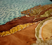
 I LOOOOOOOOOOOOOVE arashi, which is also known as pole-wrapping. It makes a lovely wavy pattern over the fabric.
 Here's my little sample:
I can't wait till next Monday when we wash out our clamp-dyed pieces!
Stay tuned for more student work- I've got a bumper crop of T-shirt screenprints that my amazing young teens have been cranking out this week. I've never had such a prolific group of screenprinters! Tomorrow is our last day of art camp, so I'll have more pictures to share soon.

Sunday, July 22

Witty Sol

Strolled up to the art museum this afternoon via the free parking lot near the Azalea Garden and noticed some new gardens have been laid out between the dual sidewalks leading up to the stairs. This back section of the museum grounds has been torn up, fenced off, and utterly ugly for YEARS while the new underground parking garage was being constructed. So it's very nice to see this place beautified again.
So I first notice the square sectioned layout of the beds each surrounded by boxwood hedges. Then I see all the lower bed is filled with Blue/violet flowers.
 The next bed appears to be all red flowers, and I look ahead predicting what the next one might be. YES! it's filled with yellow flowers! How neat, I thought, to have primary color flower beds behind the art museum! 
 The final bed is filled with stripes of white flower plantings.
 Here they are from the top of the stairs: Check it out- the beds are all laid out in different directions of stripes. Very creative gardeners back there!
 Then I came upon a sign:
 Very creative gardeners indeed! It's a Sol Lewitt design! It's not just a garden, it's ART!!
I love that the art of the museum spills out into the environment. And I love that Lewitt made me notice something, predict something, and appreciate the idea of a garden in a new way.

Wednesday, June 27

Thought Bubbles

 Classes have been over for over a week, but I forgot to get pictures of this final piece my kids made in the hectic rush of the last day. This was the best semester ever with my Silkscreen for 11-13 year olds! I had a group of 8 charming and mature young ladies who worked quietly and diligently the whole time. Our 2 main projects included a printed word bubble, which the students then collaged with magazine letters, and a 3-layer self-portrait stressing value changes in color.
 For the last class I got a 4x6 foot plywood board, which the students painted with stripes and spatters (they wanted it "rainbow", but I think we went more "circus"). For such a quiet group of kids, they must have incredible inner lives to produce this vibrant work of collaborative art. With the background painted we cut out our bubbles and self-portraits, and collaged them on top.
Their "thought bubbles" include phrases like:
"crazy me"
"this is just how I am"
"Express yourself"
"Am I the only one who doesn't know what's going on?"
and of course, "How can cats be so sute but so evil?"

 Students also had an opportunity to make their own portrait/bubble collage using other prints in their edition.
I'm really going to miss this bunch of girls. This summer the age group for silkscreen is shifting to 12-16 for camp, and in the Fall I'll have 14-18 year olds for the first time. It will be nice to get more experience with teens, but I really like working with the middle schoolers. Working in the silkscreen studio requires respect, cooperation, and responsibility, and I think my students really grow through the process.
The finished "Thought Bubbles" collaboration is going to be on display in an exhibition of children's artwork at the Philadelphia Foundation this Fall!

Thursday, October 6

Fading color

my sample strip with dots and stripes. I didn't leave the bleach gel on too long, and I've got subtle pink left behind
 Last night was so much fun! I had my Stitch and Surface students experiment with rust dyeing and bleaching. The previous week we dyed a piece of fabric using the low-immersion method in multi colors, so there's a range of color there. Then last night I asked everyone to bring a Clorox bleach gel pen to see if we could get some bleached out drawings on our fabric. We're starting an abstract pattern project, so this will be a great first layer to work with.
I really like Shelby's experiment with a variety of morphing patterns

There's a diiferent effect when you drizzle vs. scrape the gel on. These were left longer and there's yellowish color left behind

Oh that Havana Brown dye!!!! Bleached to a greenish yellow.
Here's the wall of everyone's results. If you try this at home, make sure you are in a well-ventilated area and wear gloves to protect your hands. Use this on cotton- no silk- and work on a  protected surface that won't be damaged by the bleach. Normally when bleaching fabric you'd want to dilute the bleach- and this was definitely NOT diluted and it was a very FAST bleach-out. It only took a few minutes for the color to leach away and we immediately rinsed off the bleach gel in water. This effect worked best on darker fabrics for high contrast results. Commercially dyed or printed fabrics took a little longer- the hand-dyed was best.
Unfortunately it's kind of an expensive process- the bleach gel pen cost me $2.99 and only covered about a yard of fabric before being used up. However, the instant drawing tool aspect of it being a PEN with dual size tips, made it very interesting to work with. And the fact that it was in gel form, not liquid made the results have more definitive edges.

Thursday, August 4

Itajime results

My shibori students at Fleisher were wowed by the results of their itajime/clamp resist shibori dye experiments. Clamp dyeing definitely gives dramatic and graphic results compared to the more organic tie dyeing and pole wrapping we've done so far. We also added in the fun of overdyeing some commercially printed fabrics from the scrap pile.
 The center one above reminded us of skyscraper windows at night- it had been extensively pleated and clamped with binder clips.
 The long piece at right  above was clamped with wooden blocks, one of the largest shape sets we had, and gave a very bold butterfly effect
 I really loved the snowflake results above left- showing that the wood cutout aisle at AC Moore can yield some interesting resists.
 The red and blue pieces above both used a variety of plexiglass shapes and interesting folds for great variety and repetition.
 This blue piece was really the most incredible! I'm wondering if anyone can guess what was used as a resist....
 On Monday night we also revealed our sun-fade shibori. On the second night we had taken pieces of very dark solid-dyed fabric pieces out to the parking lot and bound them with tape resists, cardboard shape resist, and thread to various poles in very sunny spots. The hope was that if we left them long enough, the sun would fade the exposed areas. We probably should have left them one more week, but there was still some subtle fading occurring on the pieces. Enough to prove the experiment worked!
There's only 2 more weeks left. I'm hoping my students will put together some interesting final projects with the fabrics they've created. I really love dyeing fabric. It's an indulgence to get to teach this class and do some more myself.

Monday, July 25

My very last grad studio!

For the past 3 weeks I've been taking an intensive 9-4 bookbinding and print portfolio class at Tyler to fulfill my very last graduate studio credits! I'm both happy and nostalgic to be so close to the end of my master's studies (I want to be a perpetual student). But here's what I made this past few weeks:
 We tried out a few different bindings including a Japanese stab binding, an adhesive flip book, and several maze books. I already knew how to do the stab binding with odd number holes, but now I know even-numbered holes as well (start at the top hole instead of the center). I've got my maze books corralled in a little purple sleeve with a notch clasp. We also learned how to construct various boxes, so my first book got a little purple magazine-style box/sleeve, and I also made a map-covered box just the perfect size for holding folded roadmaps.
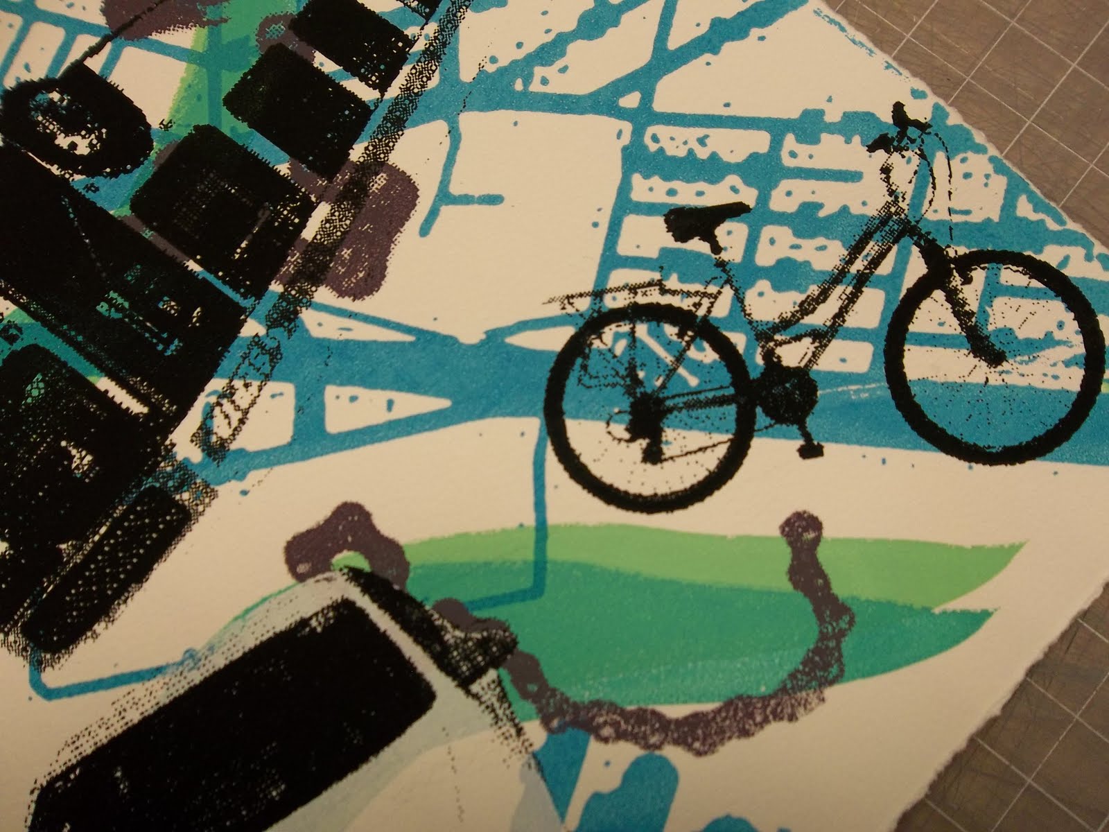
 My first real book was printed as one large image, below, and cut and folded into a little maze book. It has the map printed on front and back, a river-like path in green, a bicycle-chain path in purple, the words "Who is in the driver's seat?", and all of the various modes of transportation that have been a part of my life. There's my little red tricycle, my dad's big white van, a school bus, an Air France plane, a PATCO train, my first car (a chevy corsica), a SEPTA bus, a Turkish airlines plane, a Bosporus ferryboat, my white Jetta, and my current bicycle.
 I'm very happy with how layered it is.
 I also like how it starts and ends on a bicycle- the mode of transportation I love the most for the sense of freedom it gives.
 Printing and finishing that up took up the first two weeks, partly because I missed the mornings of week 2 due to teaching camp. But the final project fulfilled an idea I've wanted to do FOREVER.
 It marries my love of origami, coptic binding, color theory, and pattern essentials. I printed a gradation of flats from cream to dark brown, then printed subsequent layers of crosshatched stripes on the exteriors. The interiors have a gradation from pink-orange-yellow-green-teal- and purple shifting from stripes to squares to triangles in increasing complexity and back.
 Each page (56 of them) was folded into an origami book that springs open and snaps shut revealing a surprising interior to these rather formal and monotone exteriors (got to watch out for the quiet ones).
 The great part about the coptic binding is that it allows the pages to flex, snake-like. It's a very playful book/sculpture.
In critique, my professor noted how meditative it was- the layering of the print colors, actually crosshatching the print instead of printing crosshatch screens, all the folding, the one-by-one process of coptic binding, and the motions the viewer must go through to view the interiors. Seems I can't get away from that meditative process. It's the same as stitching- all that repetition and slow building of something.
I could use some meditation.

Friday, December 31

Cadeaux!

If you're related to me and you're a woman you can pretty much expect to get a scarf for Christmas. Last year it was cobweb felt scarves. This year I decided to buy some silk scarf blanks and have some shibori fun. It's too bad I had to give these away...... I would have kept and worn all of them.
 On the left I folded the scarf in half for an end-to end symmetry, then stitched  a running stitch along a pinched undulating fold up the length, and dyed it in a low-immersion bath with lemon yellow and cerulean. Then I gathered the remaining fabric into a handful and bound a few rubber bands around the bundle and overdyed it in jet-black, leaving a bit of yellow tip untouched. The middle scarf was also folded in half, then stitched through both layers with a running stitch in a meandering wave/spiral pattern. It was dyed the same way as the first, including the rubber bands and black overdye. Jet-black comes out a dull navy if it isn't too strong.
 The third piece on the right side above was first bound to make a large tie-dyed circle at each end of the scarf and dyed cerulean, but the bath was too weak or not long enough and nothing came out. So I bound a few ping-pong balls with rubber bands into the silk and  overdyed jet-black. Since the ping-pongs float, there's an interesting gradation light/dark for each side of the ball since half of it floated above water and half was submerged.
 Then there's the warm trio. The left was folded in half, then in thirds, then in triangles up the length of the scarf and clamped with one large alligator clip in the center of the triangle bundle, and 2 smaller clips on the corners. I LOVE how that one came out. Clamp dyeing is fun as I can combine my love for shibori with my love for origami. The center piece was folded in half, then thirds, and an undulating line was stitched "makinui" style on the fold for the chevron effect, then scrunched in a jar and low-immersion dyed with burgundy and yellow for the mottled effect. The right piece uses my favorite shibori pattern- "mokume" or woodgrain. I folded the scarf in half and half and half again, then I stitched two squares in rows of running stitch back and forth. Everything was gathered tightly, like in all these techniques, then dyed in burgundy and just a little yellow. I like how the burgundy MX dye travels into the fabric, changing color slightly as it goes.
I still have that last one. Shall I keep it? I have one more gift to give, but I don't think these colors would be good for the recipient. And I bought twice the number of scarf blanks than I needed, so I could play some more. Any favorites out there? Which pattern should I do for this last cadeau? (cadeau=gift in French if you weren't familiar).

Tuesday, November 16

Happy Mail!

My copy of "Eco Colour" by India Flint arrived today!! I've been more and more interested in surface design and dyeing. I'd like to incorporate more of it in my classes, but am leery of bringing powder dyes into the shared studios. Just not the best or safest place for dyeing. So perhaps I'll find some new possibilities in this book. India Flint gets some great results- check out her website.

Alas, I'm super swamped with end-of-the semester papers to write, so I'm going to have to save "Eco-Colour" as a reward for my hard work in 3 weeks time. The blog may get a little slow... but I'll be back to full speed eventually.

Sunday, September 26

Visual Response

It's so nice to stitch something new. We were asked to make a "Visual Response" to our first 2 weeks of internship in the art classroom. I've had an interesting 2 days over the past 2 weeks with my very organized coop teacher. I decided on a  very organized image with a floor plan of the oddly-shaped classroom showing the limited sight lines. The behavioral monitoring is represented by the numbers and the stars. I decided on the color wheel because the curriculum starts off very formally with elements and principles of design. I even noticed that in a way I've included aspects of all the K-4 projects I've observed so far: color wheel, radial designs, and wacky interiors.

The 9-square was a found cloth. I machine stitched the appliques and then hand embroidered the details. Made it go a lot faster. The whole thing measures about 8 inches square. Stylistically I think it goes quite well with the travelogue embroideries I did over the summer. This is an interesting way to sum up experiences. You have to filter all the information and draw out the most significant points. It fits in with the newer studio-based research, learning/discovering new connections by looking back on what you've made, tracing your thought patterns...

Saturday, August 28

How I do

Sometimes people ask me how I get started one of my embroideries. For me it starts with sketching or a photograph or a combination to break down the composition into simple geometric areas. Then I select the fabric I'm going to use, perhaps applique. Then I go to the threadbox and pull out my "palette". I find it easier to make choices when the selection is limited, so I narrow it down at the beginning, before I start stitching. It makes for a more harmonious whole in my opinion.
Happy stitching!

Wednesday, August 11

Loopy Samplers

My own embroidery production has been slow of late due to all the teaching and planning I've been doing. In fact my fingers have often been employed with the needle- but all for the benefit of others... My Stitch and Surface students, however, have been very productive and have created some stunning explorations of color, line, and mark for their original loopy samplers.These 2 responded to some existing color on the fabrics they discovered in my grab bag. The one below is the most angular of the group- and for some reason reminds me of The Jetsons.The next two pieces show a really wide range of stitch exploration. I think both students were working through a stitch encyclopedia for inspiration and mastery.The fly stitch/french knots are lovely..These are mostly needlepoint and counted stitches but they're offset by the random placement of overlapping shapes and some more mark-making areas.Best of all this loopy sampler has transformed into a tree and she has discovered color blending of threads on the needle for some more gradation of color.
Keep Stitching!