Pages

Monday, August 15

Stitch and Surface intensive

Last week I spent every day from 10-1 at Fleisher teaching the week-long Stitch and Surface intensive to 12 fabulous ladies. For the week I had a theme of photography as inspiration, but it branched out a bit and we squeezed a LOT of stuff into 15 hours of work over 5 days. We made:
  • a doodle-inspired sampler to see how drawing marks and stitch marks correlate
  • a cyanotype on fabric
  • a shibori-dyed piece of fabric
  • a handbound book to hold our handouts and sketches
  • a final project utilizing our cyanotype fabric or something else
 Kathleena used lace as a negative, stitched the outline of the shapes in orange double running stitch, added a dancer copper pin, a gold shisha mirror, and a beaded fringe eventually it will have a backing fabric like a banner and some more stitches and objects. It was a very experimental piece without too much pre-planning. Sometimes allowing your creativity to flow out can lead to great things. You just have to be open to it.
 Bonnie had a beautiful photograph to work from of a seascape looking down along a cliff. It felt Irish or Northern Californian. She created a hand-drawn negative on mylar, and added lace at the top for a combination print. Then used a very painterly approach to her stitches for color and texture.
 Donnetta had a lovely book of Vermeer paintings and created a hand-drawn negative on mylar for her "Girl with a Pearl Earring". She then took another painterly approach using satin stitches for the planes of the face and head scarf. A lace frame in the cyanotype contact print completes the composition.
 Ellen had a book of botanical photographs in black and white. She photocopied a page and cut a paper stencil for her negative. It created a bold silhouette for her cyanotype which she then filled in with satin stitch, fly stitches, and backstitch with an eye for light and shadow in color.
 Kathryn had an acetate negative of a forest mountainscape for her cyanotype. She then created a scrapbook-like foreground frame in fabric collage for color, and stitched a trompe l'oeil twig below the photo. She'll add more detail into the cyanotype, but it's a very soft-looking memory image now.
 Julie announced at the beginning of class that she didn't like to hand-sew! But she ended up with  a lot of embroidery after all. Her inspiration was a magazine fashion photo. She did make a hand-drawn mylar cyanotype print, but ended up scanning the photo and digitally printing it on fabric to add to the fabric collage. She used a lot of fusible web to applique the fabrics, but will add more stitches and embellishments later. I love all the color and pattern in this one, and the experimental way she went about building her image.
 Nicole tried out the cyanotype, but for her final project did a straight embroidered image. This abstract-looking composition is actually a reproduction of a microscope view of liver cells. It fits so perfectly inside the hoop, I told her she should use the hoop as a frame like many DIY embroiderers are doing.
This last project was done by Mary Elizabeth Nelson, who teaches the book arts class at Fleisher. She had a real goal to learn as many stitches as possible, and explored each one in a series of sampler composition pages. It took some problem-solving to think about how to do each stitch on paper instead of fabric, since in paper you need to prick your holes prior to stitching, and too many holes can cause perforation and tearing (no satin stitch!). She ended up with 4 complete sampler pages which she bound together with vellum covers and interleaves between the pages.

What a productive week! And what creativity and individuality! I've probably said this lots of times before, but I feel like I've done a good job if everyone's voice shines through the projects, and they don't all look the same. Now I've got to come up with something new and wonderful for the Fall session!!

Sunday, August 14

A bold black line

I've been stitching up a storm over here ever since I was informed of an exhibition opportunity for February. I'll be having a solo show at the Shipley School's gallery, and I want to have new work for the show. My past 2 years of grad school have been more focused on education than studio work, and the studio classes have projects that aren't always related to my preferred focus of medium or subject matter.

So to that end, I've begun at least 2 new pieces- both long, narrow cloths. One will be a vertical river-like strip, and this one will be a horizontal panorama. I've been quite enamored by a spool of black tatting-weight thread lately, and have been enjoying drawing with it on cloth.
 This skewed view is a night's worth of whipped backstitch to draw the Ben Franklin bridge and Camden waterfront onto some red silk I cut off my wall piece. The whole piece will be about 3 ft long and only 4 inches wide. I pieced together the panorama from various screen shots from Google street view, traced it onto vellum as a pattern, but forgot my transfer paper, so have been free-handing it. I really like line drawing in thread, and a whipped backstitch makes such a lovely line.
For the past week I've been teaching a morning intensive Stitch and Surface class, and the black thread was brilliant on this yellow arashi linen. This is my demonstration sampler which built up as I showed students individual stitches. The bits of color are either Shisha embroidery or reverse applique pieces. I love, love, love reverse applique....
The spool of black thread is nearly exhausted. I'm going to have to run out for more soon. I wonder sometimes how many miles of thread I've stitched in my lifetime...

Thursday, August 4

Itajime results

My shibori students at Fleisher were wowed by the results of their itajime/clamp resist shibori dye experiments. Clamp dyeing definitely gives dramatic and graphic results compared to the more organic tie dyeing and pole wrapping we've done so far. We also added in the fun of overdyeing some commercially printed fabrics from the scrap pile.
 The center one above reminded us of skyscraper windows at night- it had been extensively pleated and clamped with binder clips.
 The long piece at right  above was clamped with wooden blocks, one of the largest shape sets we had, and gave a very bold butterfly effect
 I really loved the snowflake results above left- showing that the wood cutout aisle at AC Moore can yield some interesting resists.
 The red and blue pieces above both used a variety of plexiglass shapes and interesting folds for great variety and repetition.
 This blue piece was really the most incredible! I'm wondering if anyone can guess what was used as a resist....
 On Monday night we also revealed our sun-fade shibori. On the second night we had taken pieces of very dark solid-dyed fabric pieces out to the parking lot and bound them with tape resists, cardboard shape resist, and thread to various poles in very sunny spots. The hope was that if we left them long enough, the sun would fade the exposed areas. We probably should have left them one more week, but there was still some subtle fading occurring on the pieces. Enough to prove the experiment worked!
There's only 2 more weeks left. I'm hoping my students will put together some interesting final projects with the fabrics they've created. I really love dyeing fabric. It's an indulgence to get to teach this class and do some more myself.

Monday, August 1

Some more softie fun

The great part about teaching a class sometimes is that I get the fun of making samples. The Softies class for adults at Fleisher is halfway finished, and I've been able to make a few myself to demonstrate specific skills. Below is a porcupine softie. He was made by drawing a pattern, tracing and flipping onto white broadcloth, using black fabric paint to create detail and texture, and then cutting out, sewing, and stuffing. He was a sample piece for the idea of a 2D silhouette shape becoming a 3D object when stuffed.
 For my porcupine I actually asked on facebook for ideas from my friends what animal I should make. The person who responded is getting to keep this one.
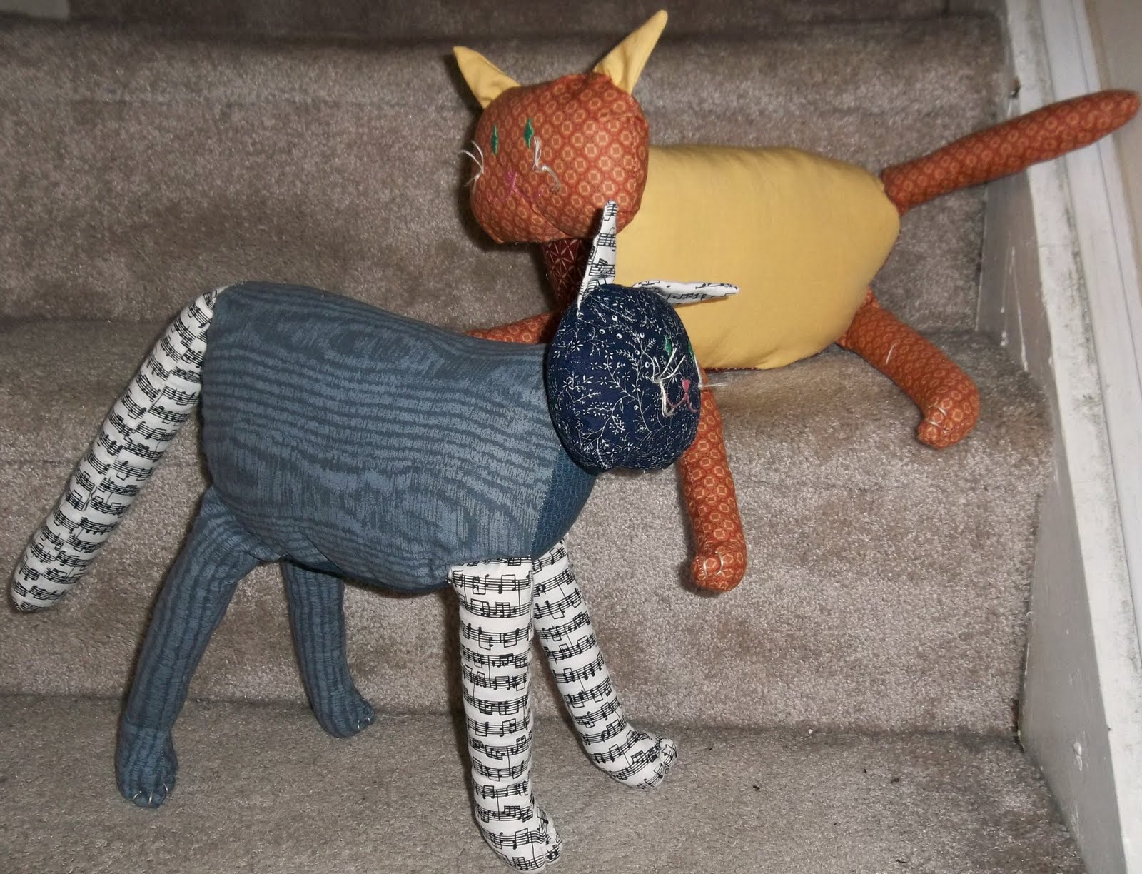
 My 2 kitty cats are sort of a sample piece. I'm going to use them to show how to make a more complex and multi-limbed construction. The ears, tail, and legs have to be sewn and stuffed before being inserted into the head and body pieces, and then the head and body are stuffed and joined together with a blind stitch.
I made these two for my niece's twins, because they got so excited by my student's cat softies I'd also posted on facebook. There's a calico cat which reminds me of my mother's cat, Putter, and a tuxedo/musical cat which is a lot like my own cat Jolie. They're an awful lot of fun to play with as a pair, especially when someone discovers a mouse finger puppet in my sewing nook, and ends up playing cat and mouse and laughing with me all night.
Adults shouldn't forget how to play- it's important to play with your kids, and the ability to play is a key component to artistic and creative thinking!

Tuesday, July 26

Process color experiment

I've been doing screenprint for quite a while, but with my kids I usually teach using freezer paper or contact paper stencils to block the screen. I rarely venture into photo process with them because the added complication of coating screens isn't direct enough for my pre-teens. Personally I really like the hand-drawn qualities of using screen filler or the boldness of cut stencils. So I've never really done any 4 color process in screenprinting, and it's been niggling in my subconscious that I really should know how to do it.
So I started off with a photo I took at Cumberland and American Streets of the trash-strewn lot in front of this beautiful mural, and doctored it a bit in photoshop to boost contrast and saturation. I also tried to format it so it looked kind of like a Polaroid or one of those IPhone instamat pictures (I don't have an Iphone and I so want to try out some old-timey photo aps). Then I proceeded to get totally lost in Photoshop trying to figure out how to do the color separations!
Google to the rescue! I found this fabulous video tutorial that not only goes step by step for doing the separations, but also showed how to build the image back up to check if it was done correctly. Check it out. He's a little rambly, but it's slow enough to follow easily. I also kept stopping and starting so I could do each step as he described it. And here's the result:

That's my re-built image in CMYK. I'm hoping to burn my screens tomorrow, and then I can try it out with ink on paper. Unfortunately it probably won't turn out as perfectly as my lovely Photoshop play.

Monday, July 25

My very last grad studio!

For the past 3 weeks I've been taking an intensive 9-4 bookbinding and print portfolio class at Tyler to fulfill my very last graduate studio credits! I'm both happy and nostalgic to be so close to the end of my master's studies (I want to be a perpetual student). But here's what I made this past few weeks:
 We tried out a few different bindings including a Japanese stab binding, an adhesive flip book, and several maze books. I already knew how to do the stab binding with odd number holes, but now I know even-numbered holes as well (start at the top hole instead of the center). I've got my maze books corralled in a little purple sleeve with a notch clasp. We also learned how to construct various boxes, so my first book got a little purple magazine-style box/sleeve, and I also made a map-covered box just the perfect size for holding folded roadmaps.
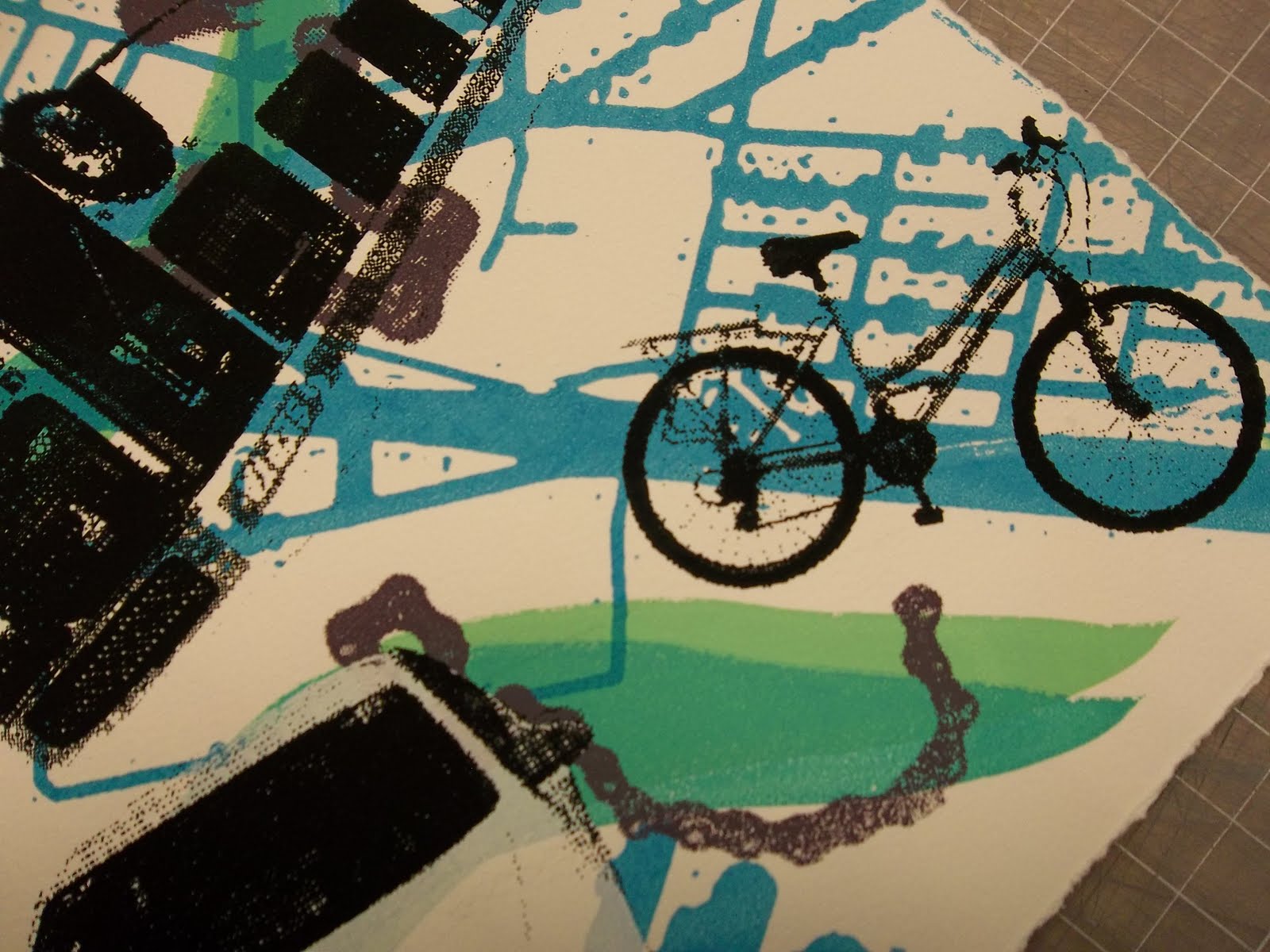
 My first real book was printed as one large image, below, and cut and folded into a little maze book. It has the map printed on front and back, a river-like path in green, a bicycle-chain path in purple, the words "Who is in the driver's seat?", and all of the various modes of transportation that have been a part of my life. There's my little red tricycle, my dad's big white van, a school bus, an Air France plane, a PATCO train, my first car (a chevy corsica), a SEPTA bus, a Turkish airlines plane, a Bosporus ferryboat, my white Jetta, and my current bicycle.
 I'm very happy with how layered it is.
 I also like how it starts and ends on a bicycle- the mode of transportation I love the most for the sense of freedom it gives.
 Printing and finishing that up took up the first two weeks, partly because I missed the mornings of week 2 due to teaching camp. But the final project fulfilled an idea I've wanted to do FOREVER.
 It marries my love of origami, coptic binding, color theory, and pattern essentials. I printed a gradation of flats from cream to dark brown, then printed subsequent layers of crosshatched stripes on the exteriors. The interiors have a gradation from pink-orange-yellow-green-teal- and purple shifting from stripes to squares to triangles in increasing complexity and back.
 Each page (56 of them) was folded into an origami book that springs open and snaps shut revealing a surprising interior to these rather formal and monotone exteriors (got to watch out for the quiet ones).
 The great part about the coptic binding is that it allows the pages to flex, snake-like. It's a very playful book/sculpture.
In critique, my professor noted how meditative it was- the layering of the print colors, actually crosshatching the print instead of printing crosshatch screens, all the folding, the one-by-one process of coptic binding, and the motions the viewer must go through to view the interiors. Seems I can't get away from that meditative process. It's the same as stitching- all that repetition and slow building of something.
I could use some meditation.

Sunday, July 24

My "wall"

In March of 2010 I began the biggest embroidery I'd ever made with this little sample piece as inspiration:
 It sat in a corner untouched between August 2010 and June 2011,  much to my chagrin because I absolutely HATE unfinished objects (no UFO's allowed in my house, haha...right). But i finally picked it up again, pushed through to the finish line, and here it is:
You can see my wall "Girard" at the Fleisher Faculty Show now on display through August at Fleisher Art Memorial, 719 Catharine Street, Philadelphia. There's lots of other amazing work by my fellow faculty including 2 other embroidered pieces. Check it out!


Saturday, July 23

Critter Softies 2011

It's summer art camp season! Critter Softies was such a hit last year, that we offered it again this summer at Fleisher. I had 8 kids aged 8-10 join me for a new adventure in fiber art. We did felt finger puppets, a 2-sided marker detail creature, and a multi-part patchwork creature. Here are some of he results:
 I loved this monkey (that's a lot of marker coloring since we started with white muslin), and this patchwork duck. The duck's wings were left unstuffed for some flop, and the felt beak was sewn on before assembly so it would also stick out and flop a bit.
 My one boy in the class made this "sick dinosaur" complete with thermometer, bandaids, blanket, and tongue sticking out. His felt creatures include a family, 2 dinosaurs, and a house for the family to hide in.
 The rainbow unicorn was quite a feat to stuff with those skinny legs and the clumpy fill I got from DickBlick. I've now discovered that brand names in stuffing matter- Polyfil and Crafter's Choice are the best- nice and squishy.
The turtle at the top there ended up being a 2-headed turtle because I didn't catch her in time to remind her to flip her image for the 2 sides to meet up properly. But her teddy bear turned out really well.

This turtle had a whole patchwork of felt squares to applique on for the shell, and the bunny rabbit had a very complicated selection of patchwork that she planned out before we could sew it.
The kids were incredibly focused for a whole week of softie-making. It's always a bit of a whirlwind because I do all the machine sewing for them. But I love getting to be a part of their creativity and help them bring the visions of their imaginations to life!

This summer I'm also teaching a grown-up softies class. We're 2 weeks into a 6-week class, and there's already been some fabulousness I hope to share soon.

Sunday, July 10

Wheatpasting!

It's been a busy week writing thesis, starting a new bookbinding/printmaking class at Tyler, planning summer camps, etc. Today I took time out to complete a project I started with the artist-in-residence we hosted at Kensington Culinary arts High School during my student teaching this past Spring.
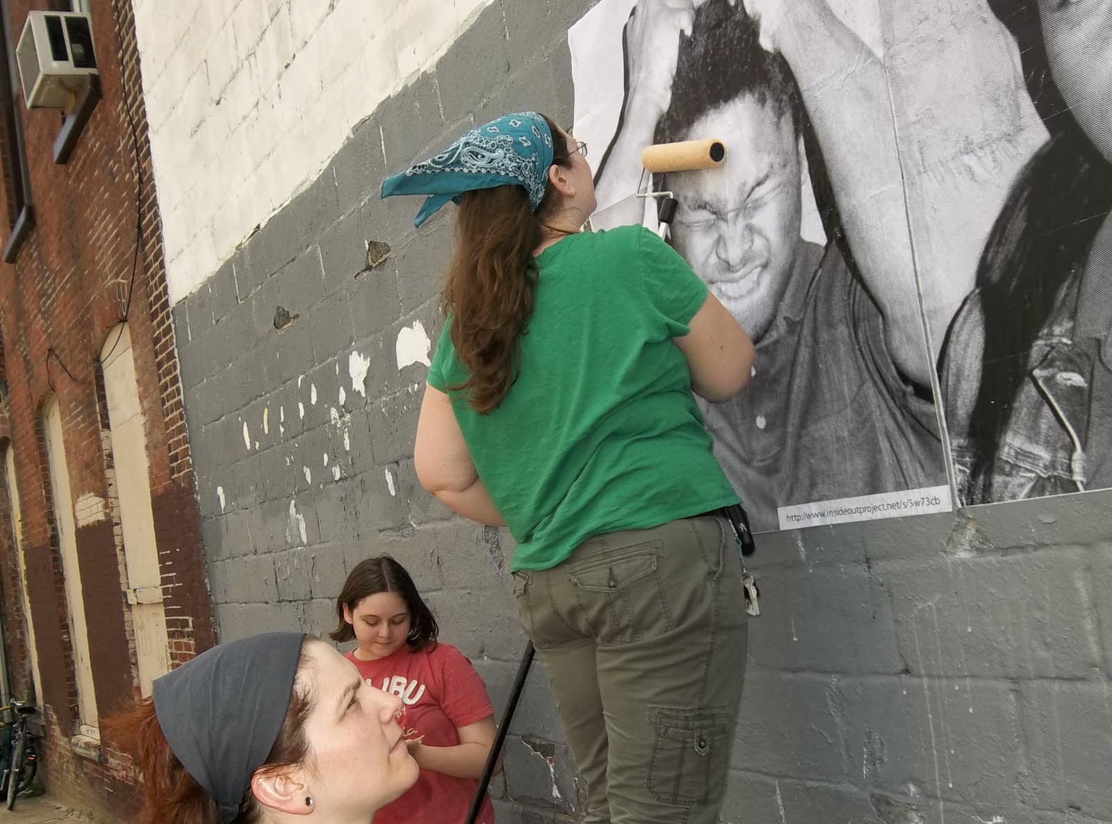
 Students learned about portrait photography and created emotive expressions. Our artist, Alana Bograd, discovered a global art project started by French artist JR, recipient of a TED prize, where people could upload portraits and have them printed and posted back to them in poster size to be installed in neighborhoods around the world.
 We had permission from the owner of the building across the street from the high school to wheatpaste our posters on a wall facing the school. Our Print Center artists, several teachers from the school,a few students, and even the Principal showed up to help with the installation. It was very messy and windy, but very fun and exciting to see these huge portraits lining the wall.
The Inside Out project to me seems to be about making the invisible visible, making voices heard, helping people take ownership of their neighborhoods and culture. How often do you hear something positive about urban teenagers?  These kids' photos are larger than life and stare back at the school. Most of them were seniors who have now graduated and some of whom are on their way to college. I hope some of the students next year (if the mural lasts that long) feel inspired by it. I hope the students who participated feel proud to be present in their neighborhood. I hope the posters don't get defaced....

JR says, "Art can change the world."
I believe it.
Here's to changing one little corner of Kensington.

Friday, July 1

Multiple Perspectives

I'm in full thesis-writing mode. Since my topic is about use of blogs in reflective practice for arts educators, it makes sense to walk the talk here. So here's where my head is at this point:
Reflective Practice requires taking multiple perspectives on a situation or experience. Like Duchamp’s cubist "Nude Descending a Staircase", the reflective artist-teacher takes a look back on a 4-dimensional experience(teaching being a time-based activity) and critically revisions it to fit together the multiple vantage points into a new understanding. I'm liking this cubist metaphor, and I wonder if/how I can fit that into the paper.
I'm also enjoying my moments of image connection to my research. It makes sense to me as a visual artist to use images to illustrate my ideas- it makes my thinking more concrete. By documenting my thought/images I can look back and track the train of thought.... Haha! more reflective practice! There's no escape!

In other news, my Wall piece is complete and delivered to Fleisher for the annual faculty show. I'll post some pictures of the final product once the installation is complete!