I've had the craziest of days. Ups and downs, opportunities and failures, joys and frustrations, progress and setbacks. AAAGHGHGHGH! So before I hit the hay I want to look at some art.
I'm glad I saved these for last, as it helps me understand that the crazy day I had was just demonstrating the texture of my life- and these works really explore texture.

"Father and Mother" by
Susan Lenz is a stunning example of texture. It contains grave rubbings on vintage needleworked fabrics, casting another layer of time onto the already history-rich cloths. Her taut quilting stitch (kantha stitch...) ripples the surface creating texture within the cloth, not merely on the surface. I want to hold it in my hands and feel its weight
(After perusing her blog I've seen that even the backs of her grave rubbing quilts have vintage fabrics, and now I reallyyyy want to touch it!).

"Crossover" by
Mary Ruth Smith also blurs the lines between quilting and embroidery, as every square inch of the surface is densely stitched with patterning. The image has a satellite view like looking down on city blocks and buildings. It wasn't until I looked through my camera viewfinder that I noticed the prominent black cross in the composition. Is it just an asphalt intersection? Or does it allude to the faith of a community? This is another one I'm tempted to call "favorite".
(the link has more of her artwork as well as her teaching philosophy with which I couldn't agree more)

I share this image of
Denise M. Furnish's "Nine Patch" not because it was a favorite, but because of its surface texture and boundary breaking. Of note, this piece won the Surface Design award. From far away it appears to be a very formal abstract painting. The beauty of the piece is on close inspection. Made of 2 deconstructed and reconstructed nine-patch quilts, the painting catches every ripple and wrinkle, brushing and caking the surface, but allowing glimpses of the colors and fibers within. It's sort of like a Rauschenberg in that way- elevating the trashed and found to serve the artist's purpose, juxtaposing the traditionally feminine craft of quilting with the oft-perceived masculine art of painting.

I had a student this week question every "artspeak" term I used. "What do you mean when you say texture?" Well, we were drawing and I explained how the marks we make to fill in shapes create the visual appearance of a texture that we may see or touch in real space. Fiber artists have the advantage of creating both visual and actual, sensual texture in their works. These artists really took advantage of that possibility.
 Most of the white areas on the right are complete. But my shoulder and wrist are getting tired.
 I started cutting into the rusted fabric to reveal the red beneath and make it look a bit more crumbly. It also saves me some stitch area.
 By the way, I also have to write a 10-page paper by Monday night. Fun.
 TaaDaa!!!!!!!!!!!!!!!!!!!!!!!!!!!!!!!!!!!!!!! It spins! It's finished! Problem solved!
 The top was great, with the pipe wrapped in waxed red hemp and using the metal disk from the original globe. The bottom had been wrapped as well, but the globe kept slipping down. After some kind suggestions and then some hunting around down in the basement, found a metal washer that was exactly the perfect diameter to slip over the pipe, but not slip over the wrapped sections. I added a piece of black felt between the metal and the globe to protect it and provide a smooth friction point.
 I'm also concerned what people's reactions to the patterns and stitching will be. The selections were somewhat arbitrary and don't precisely represent borders or specific cultures. They are more generalizations. Part of the reason for stitching was just to boost contrast- the large format printer really washed out my image.
 I started stuffing with polyfil, and of course... as usual... I run out when I only had the last little wedge to fill in!! GRRRRRRR! Good thing this isn't due tomorrow. I attempted opening up an old pillow to use the stuffing, but it was too lumpy and felt awful.


 Artist
  Led by Huberta, the main character, traveling by water up the Eastern seaboard to find her love, we set out at dusk, lanterns swaying.
 We stopped traffic as we marched down 8th street to Wharton, down to 3rd and back up to Catherine Street. We passed a quinceanera party, neighbors hanging out their windows to watch, children in the project developments rushing up to ask what was going on, and bar patron crowding the windows to see us go by.
 Huberta was accompanied by a giant polar bear, sphinx-like lions, a canoe and various other fish and animals all made of paper and lit with fairy lights. A choir sang her theme.
 We ended up back where we started with a great cheer. Somehow the long-predicted rain held off for the parade to go on without a hitch.
 I've been in and watched a lot of parades in my life, but none like this! Congrats to George and the community for pulling it off!


 This work, "Piter 1" by
 This much much larger quilt by
 "Radiant Interception" by
 "Splash" by
  For example, the light colored wide diagonal at the bottom right appears slightly more opaque as it crosses over the thin purply strip pointing towards the center because she chose a color very close to the original white. Whereas the small pink triangle above it feels very translucent where it crosses over the strong downward dark red slash because she chose a redder color for the overlap. What's in front? What's behind? What's transparent? What's opaque? The answers aren't clear, which makes this a very exciting and complex quilt!
 About 18 fibers students from Tyler piled into buses and cars this afternoon and headed out to the


 I love seeing the back of the previous page's stitching as you flick through the "book" on her website. The markings break the tight lines of the blueprints, marking perhaps how the site was actually used by children in play.
 The internet is a wonderful thing, especially when it can introduce like-minded artists to each other. I like how Amy gives equal weight on her website to all her areas of artistic focus. Although I wish she'd write more about them in an artist statement or description of her series so we could have insight into her process (hint hint?)


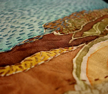
 This is a detail of the Kantha stitching from the previous post. I made it as a sample for my surface design final. The reds were all clamp dyed, the blues clamp-dyed and discharged, and I have a nice piece of rust-stained cotton ready to go. In class today I pinned all 3 pieces up on the wall to get some perspective and decide on scale. I've been persuaded to really make it a wall. This will be a huge project to finish in the next 3 weeks. Lord help me. The final dimensions will probably be about 4 ft square!