Pages

Showing posts with label printmaking. Show all posts

Saturday, July 9

Skirkanich 5

When I think about the brain and MRI imaging I always thing of Rorschach blot symmetry. We have bilateral symmetry in our bodies, but not every function in the brain occurs bilaterally. Activity may be localized to one region of the brain in charge of a particular specialty, but even then information passes all over to communicate to the body for movement or the mouth to speak, etc. During our lecture on force networks the idea of paper crumpling came up as something that creates a network of folds and tension points. I wanted to combine these to ideas visually but I didn't want an folds or crumples in my final paper. I started some inkblots on a piece of folded mylar, then transfer printed it to watercolor paper (I might want to try a different, smoother paper as I didn't like the resulting texture in this one) I made  bunch of those, adding some watercolor by reprinting over the india ink. I did try crumpling one of my watercolors, but guess what? Thick watercolor paper doesn't like to crumple!! I folded a piece of newsprint in half so my crumple would have bilateral symmetry, then overlaid it on my inkblot and used a seam ripper to poke holes through the papers to transfer the crumple nodes to my painting. Finally I stitched black thread to create edges between the poked nodes. I'm going to take all my experiments with me on Monday to share with the group. Depending on feedback I may continue doing these or maybe continue my polka dot nodes instead.
However, there is still something dissatisfying with these. I'm really only exploring the basics of what a network looks like in these pieces. There is no corresponding data resource that I am trying to visualize. I feel they would be more meaningful if they were connected to a data set in the real world.... But what should that be and how will I find it?

Thursday, July 7

Skirkanich 4


Something about all our talk of networks and topology and brains made me think about hyperbolic structures and crochet. Crocheting mirrors some network structures. I think of a crochet stitch like a little pi symbol, with a loop at the top (a node) and two legs (edges). A hyperbolic surface curves to maximize surface area. In physical space it takes up 3 dimensions, but topologically it is flat. If you have an endlessly branching network (each node subsequently branches off to two new nodes ad infinitum) eventually you run out of physical space to place the next generation of nodes as they branch outward and the surface begins to curve. The brain appears to have folds and ripples like this- it's one way to pack a lot of surface area into a small space. I made this small hyperball in a rainbow variegated yarn, which when complete reminded of the fMRI colorations showing activity and connection. I might make another in white and then stain specific areas.

Just as I felt a need to explore the topology idea in my previous post, I also want to explore different network structures. I played with "inking" this polka dot stamp I had with gradations of watercolor. It's beautiful, subtle color. The polka dot stamp creates a consistent and reproducible field of nodes upon which to play. I first did a little pencil and watercolor work (below) inspired by some discussion of the "Plinko" game.
Then tried a branching network, stitching the edges and then painting in the resulting negative space- the holes. I didn't quite understand the lecture we had that discussed brain topology and "holes". Have to think about ti some more. I'm still playing.


Saturday, August 2

Recent work

I've been working at home and at Fleisher mostly lately- trying to spend time with the family but still get some art-making time in. I took a 2-day silk aquatint workshop at Fleisher last week. It was completely different than I expected, but I'm happy with the results and the possibilities it has for working with kids. I can't imagine doing it in elementary- but older kids could really do well, as long as there's a press available. I don't think it will really become a regular thing for me because I seriously hate inking plates.
 Above are the cards I printed. I wanted something useful for my efforts, so I printed my plates as a bleed print on one end of a 6x10 inch sheet. Below is my plate after printing and cleaning it off again. It works a little like a collograph. The screening adhered to the plate gives a texture that holds the ink well. Then you paint over it with gloss medium/white acrylic to create the design. Thinner washes create gray tones, and building up layers or using thick application creates the lights. My image was from a sketch of overlapping patterns from my sketchbook.
 I'm very happy to have completed this piece:
 It started as 2 photos from 7th street in south Philly. The background was the side of a neighbor building from a very recently torn-down building, and the wallpaper was still hanging on the walls. The overlay was from an Isaiah Zagar mural that had a doily impression in clay. The title is "Domestic Disturbance". It might be a bit harsh of a title, but it seems a propos.
I've just ordered the above digital image and the Queen Wyeth mashup from my last post to be printed for me from Spoonflower. The one above combines the rough wall of a shed on Norris street near my home and a pattern from a grill at Haghia Sofia in my former home of Istanbul. It blends together two extremes of environment- one run-down and poverty stricken, old from neglect, the other opulent, old but preserved. Me in the middle of two places. I've dubbed it Norris Sultana for the time being.
I've got a few more weeks before school starts again. Hopefully I'll be able to keep stitching.

Saturday, February 1

Smelly but beautiful

 My Stitch and Surface class tried out bleach gel pens for their surface design technique this semester. First we dyed fabrics black and navy. Then this week we all brought clorox gel pens to experiment with bleaching.
 We opened up the windows and I set up a fan to ventilate, but it was a cold night for that!! Some people drew directly with the pen-tip built into the bottle design. Other brought along sponge and rubber stamps to try printing with the bleach gel.
The variety of colors and marks were interesting. One has to work a bit fast with bleach gel, because it should be neutralized shortly after the color begins to change.
I wonder what these marks and fabrics will lead to over the rest of the semester!

Sunday, August 11

Creativity in the woods

I've been home for a week (somehow this week flew by in comparison with the week before). I thought I'd look back on the artwork made by myself and the other participants at the residency in Montana. It seems far away now, but I'm still feeling the restfulness that grew while I was there.
Tobacco Road Studios was a great location with 2 studio spaces in the garage, and a wrap-around porch where I made my workspace. Our hostess was working on an elemental series and cut a huge spiral in the lawn for "earth". The elements and trees around the property were inspiration for many of us.
 I noticed how most of the trees grew in clusters,like families. their root systems are shallow because the bedrock is so close to the surface, and the interlocking of the roots help the trees support each other. A great deal of underbrush has been cleared out of the surrounding woods over the past few years. I noted numerous stumps dotting the landscape and thought it would be interesting to take prints from them.
Woodblock printing with ink and a brayer was a total failure as it picked up only the sawmarks instead of the beautiful rings. So I switched to oil pastel rubbings to capture the texture and age of about 8 stumps. After heat setting the pastel I experimented with walnut ink on a few, but didn't like the loss of contrast.
 The 2 small stumps with walnut ink were appliqued to some red sunprinted cloth I'd made in grad school. I stitched a few rings and used feather stitch for roots reaching out and entangling. It needed a little something extra, so I added  a ring of red seeded "fire". Wildfire is a major concern in the Rockies in midsummer. The firetruck came out at one point because someone noted smoke from our (well-tended) campfire! But fire is needed at times to control undergrowth and bring new life to the forest floor as well. I finished this 12-inch piece up in a day and then moved on to a larger piece.
 I waited for a full sunny day and painted out a yard and a half of cotton with blue, ochre, and emerald setacolor. I laid plant material I'd found on the forest floor on top and let the fabric dry in the sun for a lovely organic sunprint. Five more stump prints were appliqued onto this 4x5 foot background, and then I spent 3 straight days doing concentric circles in running stitch until my fingertips ached.
 On our last night we had an open house despite rainy weather. All our artwork was hung and displayed around the porch. The event was publicized in the local paper and we had a number of adventurous souls venture out in the rain to visit. Here are some of the other artists' work:
 Michelle Menard of San Francisco delighted us with a puppet show she developed over the week. She created all the characters and scenery from painted cardboard and papier mache. Above is wise Ladybird in a cage and below is the blue bird of happiness nesting.
 In the evenings we gathered on the porch for some basketweaving lessons from our host's mother, and they were displayed along with the rest of our art:
 I'm quite proud of my tight little reed basket. I've always enjoyed weaving....
 One of the major events of the week was a pit firing for the ceramic pieces that had been made. It was a little scary to do after all the fire warnings, but I helped out by keeping the surrounding area quite damp with a hose. A 4 foot deep pit was dug out, the ceramic vessels were loaded in the bottom and the fire was fed over the course of 3 hours. Finally we let it burn down, and by morning it was cool enough to unload.
 The woodfire makes an amazing and unpredictable smoky effect on the clay body. Our hostess, Christina Barbachano's pieces are above.
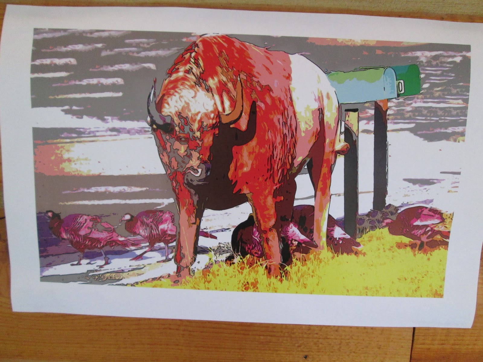
 One of the local artists who joined us in the evenings was Nikki Meyer (also a reporter for the town paper!). She worked on a series of somewhat surreal photos of animal life, playing with real and unreal, pumping up the contrast and color to distort perception. I loved the image of the turkeys and buffalo below. Not all of the animals in this image are actually alive though....
 We had a few of Christina's high school art students up as well. A pair of them collaborated on the "Dr.Seuss Tree" below, transforming a former porch post into a fantastical tree with a strange creature in the branches. It was wonderful to watch the perseverance of the pair, as they struggled with weather and materials to get it complete.
It was wonderful to have so much time to just make art and be surrounded by other creative folk. As artists and mothers and working people, so much of our time and mental power gets distracted by everyday life and responsibilities. It was a joy to let all those distractions fall away.
 I've returned to my fair share of worries (perhaps to balance out that free time!) but  I'm trying to hold on to that rest and rejuvenation that soaked into my spirit while I was in that other world.

Monday, July 15

teen screenprint roundup

I'm only doing 2 weeks of kids camp this summer. Here's what came out of last week's silkscreen class for 12-18 year olds. We started off with collaborative abstract shape layers topped with an individual line layer. I love the serendipity of what happens in this process of sharing screens and colors. It generated a ton of diverse prints that created a perfect opportunity to talk about what makes a good print or bad print, good composition and bad. etc. These were the best of about 40 prints:
I love how the black line print looks like a shadow of the purple layer.
 This print in 2 transparent color layers showed how colors can mix.
 This very simple line layer makes this print look like an abstract color wheel to me.


 The kids donated a few of their least favorite prints to cut up and turn into an installation in our stairwell. I've always thought we needed more color in there!
 The rest of the week was devoted to screenprints. I actually borrowed the digital lab this time so the kids could develop their own computer imagery- Many brought in internet images they wanted to use. They're always very satisfied to select imagery to print instead of drawing their own. I think it's okay when working in screenprinting and embroidery- like appropriation is part of the medium itself. Additionally- it takes the pressure of adolescents worrying about their artistic skills. You don't necessarily have to be a great artist to be a good printer.

 Not bad for 8 kids who've never printed before.

Tuesday, July 9

Sunday studio glimpses

3 hours.
Finished printing my reduction relief print experiment using a Softcut block. I like that it's easy to carve, but I kind of wish it were firmer to print against.
 Stitched down that blue doorway.
Did some shibori over some dye monoprint experiments to layer some pattern. I did a polewrap over the orange just by twisting and spiraling the fabric instead of binding it like traditional arashi. The turquoise has two layers of pleating and clamping. Unfortunately, I think I'm binding too tightly, or folding too much- I'm resisting more fabric than I want to resist. Either that or the fabric is getting exhausted and just isn't taking the dye.
I'm back in the classroom this week for teen screenprinting at Fleisher. Next week brings animation and soft sculpture. After that I'm off to an artist residency!!!

Friday, September 28

Kindred Spirit

 Last Friday was the opening reception for Jeff Dentz's solo show in the Works on Paper building at Fleisher, which he was granted as part of a faculty fellowship award. Walking in, I first noticed the woodblock above and was reminded again how much I love Jeff's work. Maybe it's because we have similar interests in urban imagery- remember my "Dawn Over Tacony" stitched watercolor from about a year ago? For comparison sake:


Of course, Jeff's large woodblock took a lot more time and planning than my little watercolor. That's one more reason why I admire his work. I have great appreciation for artists who put so much time and labor into their work. The process of woodblock printing was definitely honored in this exhibit. Series of prints hung in progressively complex layers.
Along with finished prints, Jeff included several original blocks in all their inky relief. I almost prefer the sculptural qualities and intricate surfaces of the carved and inked blocks over the prints. While his prints have an airy and delicate feeling due to the translucent paper and ghostly layers of color, his blocks are raw and tactile. They hold the history of the prints they released.
Printmaking is a doubled art of process and product.

Head over to Fleisher's Works on Paper building at 709 Christian St for a closer look. The gallery is open during class hours Mon-Thurs till about 9:00pm and Saturdays 9-3. It's definitely worth a visit.

Sunday, February 19

Super week of printmaking on fabric!

Both my Stitch and Surface class and Silkscreen on Fabric class at Fleisher produced a huge quantity of printed fabrics this week.
 My Silkscreeners got to be guinea pigs as I attempted to teach deconstructed dye printing. I was inspired by artist Dianne Koppisch Hricko to try this out. Last week I mixed up some sodium alginate, we added dye, and then painted or texturized the screens with dye paste. My crew really like image more than pattern, so they were more like monoprints, but one person attempted a repeat (above), while others just printed their images twice.
 In the boat print above the left image was printed first and the right image was printed second after doing a flood stroke and letting the brown dye moisten a bit. In the tree image below, the right side was printed first, then the left. The beauty of deconstructed dye print is that the dye applied to the screen first and left to dry acts as a resist at first, but then as the dye moistens it breaks down and becomes printed as well. Some people went back in with some color to connect a repeat or unify an image.
 Below is the screen after it was printed, showing only remnants of the "tree" painting that was on it at first. Another thing I LOVE about dye printing like this is that you can leave the dye in the screen to dry and still be able to wash it out- can't do that with pigment ink without ruining your screens!!! The only thing I'm concerned about is that my sodium alginate print paste mixture might be too thin, and our soda soaked fabric might not take the dye as well as I hope. We don't have a steamer, so we're batching the dye.
 My stitch and surface class got to do their "surface design" technique this week. I brought in some weatherstripping adhesive foam and we created our own stamps with it.
 Some people used wood blocks, others balsa wood rectangles, and others cardboard squares. Some people brought in adhesive backed craft foam to use as well, which allowed them to cut out motifs instead of just using the rectilinear weatherstripping.
 We rolled fabric paint out onto plexiglass plates, then used the brayer to apply paint on the block. I hauled our fabric printing boards up from the silkscreen studio so we would have a soft surface to press into.
 There was great experimentation with repeating and overlapping:
 Some people explored color shifts and printing over pre-existing patterns:
 The metallic fabric paints look fabulous:
 Once block-printing was finished, a few students even tried out monoprinting by placing strings over the rolled out inks on the plexi plates:
I loved introducing my students to all these easy printmaking techniques. You can do so much with very little equipment or supplies. As I have some teachers in the group, I hope they'll be inspired to try these out with kids as well. (Well, maybe not the dye stuff, but definitely the block printing!!)

PS: my birthday was this week, and to have this much fabulousness going on in my classrooms was a great present!