We cannot know hot without cold, light without dark, good without bad. What a boring world we'd live in if everything only tasted salty, never rained, and was colored gray. We need contrast to be able to understand and appreciate the world around us, especially in color.
Itten distinguished 7 different types of color contrast which we use to create interest and depth in our images. Click on the links for an illustrative image!
Contrast in Hue
Contrast in Value
Contrast in Chroma
Complementary Contrast
Warm-Cool Contrast
Simultaneous Contrast (1 color can look like 2 and 2 colors can look like 1 depending on the adjacent colors)
Contrast of Extension (the appearance of a color depends on its quantity in proportion to other colors)
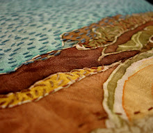
Images rarely rely on a single type of contrast, and one can usually identify several types of contrast within an image. The degree of contrast influences the mood of an image. High contrast images are exciting and dynamic, whereas low contrast images are calm or moody.
In my embroidery, Berks and Girard, the major contrast is complementary as I've used mainly red and green hues, but there is also value contrast in the various shades of red and green, and warm-cool contrast within the green grasses. The level of contrast is medium to high as there are extremes in hue and value, making it a dynamic image despite its simple composition.

No comments:
Post a Comment