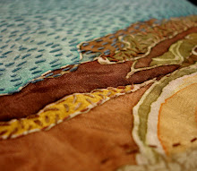
So based on that I went back to the drawing board a bit, thought some more about mapping, about creating more cohesiveness and movement with the image as a whole, and so here I am:

If you scroll down a bit to a previous post you'll see the drawing I made to determine the size divisions. There are now 4 large 9x9's that stayed virtually the same, 13 4.5x9's, 4 4.5x4.5, and 24 3x9's, so that overall it is more representative of my local neighborhood map. The shift of light to dark sort of represent what I perceive as safe zones and danger zones which also correlate to the more public and private areas of the neighborhood.
I'm still considering puncture holes and french knots in black perle, but have to sketch it out a bit more. I have an individual crit a bit later where I may negotiate some of that. TTFN.


No comments:
Post a Comment