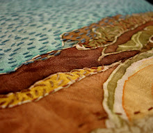
The panning image, below, was especially impressive. I enjoyed her concepts, too. The imagery included panning for gold, coins, mud pies with buried treasure, and a child building an intricate worm house. To me it spoke of creativity, innocence, and wishful thinking, but also a kind of naivete about how money is made or life is sustained.
In the University of Delaware Gallery there was a group show entitled "Decadence". I was pleasantly surprised to find the work of Pazia Mannella, a former fibers instructor of mine at Tyler. She had one of her zipper pieces upstairs, but downstairs was an installation in shocking fluorescent pink.
One first sees a curtain of crocheted plastic spilling onto the floor. The irregularity of the netting reminds me of camouflage, but the color screams for attention. The color and the inclusion of a few plastic hair barrettes in equally bright colors have a girliness to them. Behind the curtain there was a wall piece of crocheted plastic encrusted with the hair barrettes. I preferred the density of the barrettes on the wall pieces over the random addition of barrettes on the curtain, for when amassed they transform from object into texture. This kind of hair barrette are found in litter all over the city- they snap open quite easily. They remind me of certain students I've had with their hair plaited into hundreds of braids, each with one of these barrettes on the ends making music as they walk or turn their heads.
They create a fascinating texture together. I'm reminded of Sonya Clark's use of haircombs. I'm excited to see some new everyday materials in Pazia's work, and I wonder what she'll incorporate next.
Also in the exhibit was a pedestal covered in cake plates and cloches. Upon each was a beautiful "cake" made of fire crackers by Timothy Belknap , another instance of the transformation of the ordinary into the extraordinary. I'm reminded of birthday candles that can't be blown out, as well as the "can't have your cake and eat it too" analogy. We can have the beautifully constructed cake or we could have a sizzling display.
The Ice Box and Gray space were taken over by the Mural Arts Program Artists-in-residence and their student work. It took a moment to understand that the work in the Ice Box was indeed children's artwork. Many children's art exhibitions try to jam as much of each student's artwork in at once so everyone is represented. This was installed more like a gallery installation of professional artists- very well-edited. The dynamic installations show the power of collaboration and creativity that can occur in a residency.The "ransom note" above was about 8 x10 feet big. I wonder if it was done on parachute cloth and we're seeing it before its final installation on site. I was excited by all the variety of color, pattern, and typography in it.
These 2 pieces reminded me SO MUCH of the "weight of the world" project I did with my high school kids last spring- object drawings in charcoal and figures collaged together! They're amazing. I want to go back and look some more at the individual drawings.
My favorite piece by one of the residency artists was this one by Marcus Balum. This was the piece I saw that made me want to go home and WORK. It's the scale I want to be working at. It's cityscape. It's exactly what I needed to see that night.
The opening reception for the Mural Arts exhibit will actually be next Thursday, December 15th. I highly recommend going to see it.
It's so great to be going out to see art again! Now that my thesis is finished and grad school is coming to a close I feel so free to work on my own stuff, see friends again, and get out and about. It's wonderful!


I made the Respond/React pieces with my class and assistant Michael Konrad at Sayre High School, and I linked your thoughts about them on my site. Thank you for spending time with the pieces! I'd love to be in touch, feel free to contact me through my website: www.catherinetnelson.com
ReplyDeleteThanks again for checking out the show!
Catherine
Wow! Thanks for finding my blog and this post Catherine! keep up the fabulous work with your students!
ReplyDelete