Pages

Wednesday, February 29

The week before Fiber Philadelphia

I'm sure I'm not the only one who has been up till the wee hours putting all the finishing touches on pieces and hanging exhibitions this week. Fiber Philadelphia 2012 is officially opening this Friday, and galleries and exhibition spaces all over the city are featuring fiber artists from all over the country. It's amazing to be at the epicenter of the fiber world every other year.
So here's a little sneak peak at the behind the scenes of 2 of the shows I'm participating in this month. The second blog post I ever posted on this site back in May of 2009 has the beginnings of this piece:
I worked furiously on it through the summer of 2009 before beginning grad school at Tyler, and I finished all the elements for this image while in a graduate Projects in Fibers course that first semester. It is broken up into a map of the location where I took the source photo. However, grad school took over my life, and I never completed mounting the piece. I pulled it out to accompany the series of cityscapes I'm exhibiting at Nichols Berg Gallery in Chestnut Hill this month in a 4-person exhibit, "Stitch Witchery". I basted all the elements onto a backing of aida cloth, and then did a reverse applique in a rust-colored cotton to superimpose the map grid onto the image. I framed it Sunday to get it off to the gallery for installation. They are also showing my "Brick House" terra cotta and thread pieces and my other large cityscape that is broken up into a map grid as well. Poor art handlers! The opening is this Saturday March 3rd from 6-9.

 Here are some shots of my installation piece for "Not a Stitch" at B Square gallery. It is a 2 ft wide by 12 foot long length of vellum which has been pricked with a traditional sampler border pattern in a large scale (see previous post for how this project developed). The thousands of tiny holes were pricked in order to pounce the pattern onto the walls of the gallery. Monday afternoon (after a full day of teaching and a weekend of little sleep no less) I arrived at the gallery to install and pounce. The curator left me a huge expanse of wall which I quickly set to work filling.
 Much to my dismay, the paint-texture of the wall obscured my delicate pounce marks! Solution? A nice sharp pencil to trace around the pattern, drawing directly on the wall! It was really fun to draw on the wall and see the delicate pattern emerge. Installation took me about 3 hours! The pricked piece is hung in the center with the two pounced and traced patterns on either size. The grand scale and pattern give it a carpet-like feel.
This piece is impossible to photograph! Holes pricked in white paper and thin pencil lines on a cream wall! It can only be appreciated in person. So come on out to B Square gallery this Friday from 6-8.

For more info on Fiber Philadelphia check out all the listings. It's been great to see all my favorite bloggers posting about the biennial- I feel very hyped up about all the events, and it's nice to know I'm not the only one!!

Saturday, February 25

Not a Stitch

Next week I'm installing a piece at B Square Gallery for the "Not a Stitch" exhibit which will open on Friday, March 2nd. I was very honored to be asked to participate as it's in one of my favorite galleries (run by a fellow Moore Alum!), and has an  interesting international selection of artists involved.

But what does a fiber artist whose main occupation is STITCHING do that has NOT A STITCH in it!? My very first thought was to do something with pricked paper (I could at least use a needle that way), but wasn't sure what the imagery should be. Then I thought about printing an embroidery pattern:
This was a scan of an actual embroidery I did that I intended to screenprint onto fabric or paper as motifs or in repeat. However, I got a sneak peak at another artist's submission that was inspired by crocheted doilies, and then thought this one would be too similar and not nearly as interesting. So I hemmed and hawed some more.
The reason I wanted to do the sampler piece originally was because I often use this style of sampler in the classes I teach. It's an easy format where each new stitch becomes a ring in a mandala. Samplers are the traditional way for people to learn embroidery for the first time, and many people follow a pattern for where to place stitches.
 I have a love/hate relationship with embroidery patterns. On the one hand, having a pattern encourages the novice stitcher to try a new medium and become proficient with the guarantee that the finished product will be satisfactory. Patterns introduce new stitchers into the world of embroidery, but they don't really encourage creativity. I've written about some of my embroidery research on this blog before, and can affirm that embroidery patterns have been around for centuries. Once printmaking presses were invented, commercially distributed patterns became widespread. Patterns such as the ones assembled below, published by Gilbers in 1527, can be seen in countless historic samplers.

From 1527 all the way into the early 1800's, these border patterns varied very little, showing how times haven't changed much in the DIY embroidery field. But I don't understand this widespread reliance on patterns. With some tracing or carbon paper one can turn any sketch, image, or photograph into an embroidery. When I teach, I try to encourage students to design their own images and experiment with fabrics and stitches to best interpret their ideas.
Sooo.... Not a Stitch, not a single stitch. These ideas of tradition and process and creativity have been bouncing around my head. Finally, it came to me to go back to that original idea of pricked paper-for that is a functional part of the embroidery process for transferring patterns to fabric. Our stitching ancestors didn't have our fancy fading marking pens and iron-on transfer paper or even carbon paper. Pricking and pouncing is a technique that has been used in many design fields for centuries to transfer images to another surface.
I decided to use one of the ubiquitous border patterns used in so many samplers in the past as inspiration for a pricked and pounced design. I enlarged this pattern from the original 2-inch high pattern to a 20 inch high design,  making it larger than life. I used a pushpin instead of a needle to prick the pattern into vellum (it was easier on my fingers that way). When I install, I hope to pounce the pattern directly on the wall and hang the vellum on the wall, perhaps with the prickly backside turned towards the front to catch the light and emphasize the texture.
This has been an adventure, but it's really good to get pushed out of my comfort zone once in a while, and work my own creativity muscle.

Wednesday, February 22

Exhibition Reception Coming Up!

 This Thursday, February 23rd will be a coffee hour reception for my solo exhibit from 9:30-10:15 at the Speer Gallery of the Shipley School in Bryn Mawr, PA.
See the work up close and personal- for that is the best way to truly appreciate fiber art!

Sunday, February 19

Super week of printmaking on fabric!

Both my Stitch and Surface class and Silkscreen on Fabric class at Fleisher produced a huge quantity of printed fabrics this week.
 My Silkscreeners got to be guinea pigs as I attempted to teach deconstructed dye printing. I was inspired by artist 
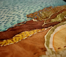
Dianne Koppisch Hricko to try this out. Last week I mixed up some sodium alginate, we added dye, and then painted or texturized the screens with dye paste. My crew really like image more than pattern, so they were more like monoprints, but one person attempted a repeat (above), while others just printed their images twice.
 In the boat print above the left image was printed first and the right image was printed second after doing a flood stroke and letting the brown dye moisten a bit. In the tree image below, the right side was printed first, then the left. The beauty of deconstructed dye print is that the dye applied to the screen first and left to dry acts as a resist at first, but then as the dye moistens it breaks down and becomes printed as well. Some people went back in with some color to connect a repeat or unify an image.
 Below is the screen after it was printed, showing only remnants of the "tree" painting that was on it at first. Another thing I LOVE about dye printing like this is that you can leave the dye in the screen to dry and still be able to wash it out- can't do that with pigment ink without ruining your screens!!! The only thing I'm concerned about is that my sodium alginate print paste mixture might be too thin, and our soda soaked fabric might not take the dye as well as I hope. We don't have a steamer, so we're batching the dye.
 My stitch and surface class got to do their "surface design" technique this week. I brought in some weatherstripping adhesive foam and we created our own stamps with it.
 Some people used wood blocks, others balsa wood rectangles, and others cardboard squares. Some people brought in adhesive backed craft foam to use as well, which allowed them to cut out motifs instead of just using the rectilinear weatherstripping.
 We rolled fabric paint out onto plexiglass plates, then used the brayer to apply paint on the block. I hauled our fabric printing boards up from the silkscreen studio so we would have a soft surface to press into.
 There was great experimentation with repeating and overlapping:
 Some people explored color shifts and printing over pre-existing patterns:
 The metallic fabric paints look fabulous:
 Once block-printing was finished, a few students even tried out monoprinting by placing strings over the rolled out inks on the plexi plates:
I loved introducing my students to all these easy printmaking techniques. You can do so much with very little equipment or supplies. As I have some teachers in the group, I hope they'll be inspired to try these out with kids as well. (Well, maybe not the dye stuff, but definitely the block printing!!)

PS: my birthday was this week, and to have this much fabulousness going on in my classrooms was a great present!

Tuesday, February 14

Notan meets zentangle

I've been having a really wonderful time with my young screenprinting students on Saturdays. I've got 6 quiet, focused 12-year-olds this semester, three of which have come back for a second semester. After working in public schools with 30+ kids it is an absolute indulgence to teach just 6. It's a wonderful opportunity to really push the possibilities of screenprinting, too. Usually I plan 3 projects and they complete 2, but this semester I'm positive we'll complete 3 and maybe even 4!
 Our very first project this semester was a group print using contact paper to block the screen. The kids each cut one shape out of a square of the contact paper for a notan-style positive/negative exercise. They did a rainbow pull of green and blue ink. The following week we experimented with different patterns for making visual texture, much like how zentangles are made.
 They used sharpie marker to draw patterns in all the negative white space, and then added color and shading with colored pencil. Some kids ended up doing sort of a color wheel arrangement.
 I've been slightly obsessed with the whole notan and zentangle trends this year, so it was fun to combine the two styles in one project. I was so pleased with how well they turned out, that I requested and got to have a hallway exhibit from our gallery director. At Fleisher we have 3 hallways that we use for rotating displays of student artwork from both the children and adult classes.
I think the kids must have really enjoyed this project- when they made their T-Shirt designs for their second project at least 2 of them used similar line and pattern elements:
Having explored screenprinting for fine art and fashion, our final project will explore the idea of advertising to make a 2-3 color print.
PS: Happy Valentine's Day!

Monday, February 13

Announcing Solo Exhibit!

Today I hung my solo exhibit at the Speer Gallery of the Shipley School in Bryn Mawr, PA. On display are about 20 embroideries and watercolors made over the past two years, all related to the urban environment. It is quite a privilege to exhibit in this venue. Considering that it is part of a K-12 school, the caliber of the work and the artists they bring in is on par with college galleries. The school is right across the street from Bryn Mawr college.
 I was concerned that I wouldn't have enough work to fill the space, especially when I walked in and saw the incredibly high ceilings! However, everything fit perfectly, and there are even a few double-hung pieces. The artwork is hung a bit higher than I normally would, but the ceiling height kind of demands it, and there is concern for the amount of student traffic through the space every day (every hour!).
 I've spent the last 2 days and nights framing everything! Originally I was planning on T-pinning the fiber pieces, but I found some great frames. That final touch really sets off the work well and gives them a certain bold presence. Otherwise, they would get lost on those huge walls! Only the larger embroideries that had been bound were left unframed, and are mounted onto a bar with velcro.
There will be a Coffee Hour Reception on Thursday, February 23rd from 9:15-10:30 with myself and the arts committee to which all are welcome. The gallery is open Mon-Fri during school  hours 8:30-4:30, and the exhibit will be up through March 23rd, 2012.
In addition to this exhibit, I also have a piece in the Heart Print show at Fleisher Art Memorial Works on Paper gallery. There will be a reception for that show this Friday, February 17th (my birthday!) from 5:30-7:30 pm.

Tuesday, February 7

An afternoon at Abington

After a Sunday afternoon volunteering at Fleisher's Print Love-in (Valentine printmaking!), I managed to get up to Abington Arts Center to see the opening of their solo series exhibit.
 Colleen McCubbin Stepanic's work commands the largest gallery. I had the pleasure of seeing these pieces grow in her studio over the past few months, but even so, the scale of her final triangle piece stunned me. I think it has great color and scale shifts throughout the composition, and she was smart to leave it in sections that could be rearranged for future exhibits.
A more sculptural hanging piece in the center, which seemed so overwhelming in the studio now seems almost understated in the gallery. I feel like it could keep going to take on Richard Serra proportions to dominantly control the viewer's experience of space.
 My favorite part about this piece is the contrast between front and back- the front side is all soft, cupping forms of various sizes, but the back is prickly with zip-ties. Colleen is an artist that transforms the mundane through repetition and accretion. The piece catches light beautifully, and there are intriguing small windows to peek through. I wonder how this piece looks with full light from the windows during the day.
 In one of the back rooms were the quirky enlarged newspaper doodles of Emily Steinberg. I especially liked these 3 large heads with some mapwork backgrounds. I really enjoy artists that have "characters" in their imagery- some recurring or morphing to be narrative archetypes. I think it reveals a glimpse of the artist's imaginative life.
 Two other artists round out the exhibition spaces, and you can visit the website to learn more. My daughter and I were lured outside by the woods and sunset light for a stroll through the sculpture garden.
 Woods in winter have so much line and texture that is totally obscured in the summer. If I ever got to make a piece for this sculpture garden I would want to do it in Winter.
 I especially liked this wall structure of charred wood by Alison Stigora. The stark black makes it stand out when seen through the trees from afar. Up close it seems more fragile- I was wary of getting too close. Like Colleen's wall in the gallery this one had a distinctly different appearance front vs. back. What seemed fort-like from the front seems precarious from the back.
 There's a performance stage set at the foot of the hill below the center that I don't remember seeing before. Framed by the stage roof and structure is an incredible swarm of yellow sparrows made of corrugated plastic strung to catch the wind slightly. I wish I could see this every day.
 Such a beautiful crisp afternoon for a walk in the woods surrounded by beautiful public art with my silly girl.

Sunday, February 5

Some Screenprinting

 I had a great printing session in the silkscreen studio the other night. I came in early before teaching my embroidery class to get my bridge repeat printed. Above you can see my 2 pieces of fabric pinned onto one of our big fabric printing boards. Usually the boards are stored away in a closet, and it's a bit of a thing to prep for printing on fabric, but I'm so glad we have them.
 I'm trying to figure out an easy registration system for fabric printing.Our boards don't have stops, so I tried marking out the measurements with masking tape to help me line up. My first repeat worked out pretty well mathematically, but I totally screwed up the 2nd repeat measurement.Luckily printing in navy blue made it easy to see the image through the screen, and I ended up lining up the image better the 2nd time than the 1st on my long border-style repeat.
 Here's the screen I prepped for it. I've got my mandala embroidery ready to go next week on the same screen to save time. When you have small enough images you can fit 2 or more on the same screen easily. i just have to keep one blocked with tape or paper while printing the other.
 I also tried repeating it vertically. This one was easier to do- I printed from bottom to top in alternating positions (1/3/5 then 2/4/6) I only goofed on the last registration- I registered vertically but not horizontally that last time!
The image started as a photo of the Ben Franklin Bridge which connects New Jersey and Pennsylvania. I've been thinking about how many times in my life I've probably crossed that bridge. I'm originally a Jersey girl, but feel more of a Philadelphian now. I'm hoping to add some embroidery to the horizontally repeated one by the end of this week. My solo show deadline looms!!!!