Pages

Thursday, May 31

What are the kids doing this summer?

Yesterday I posted my adult summer offerings at Fleisher- now it's time for the kids! For the first time Fleisher will be offering morning, afternoon, and full day class options. I'm only teaching in the mornings, but parents can select a morning class, lunchtime, and an afternoon class if they need full day camp. Each week different classes are offered for each age group. Class sizes are small so kids get lots of individual attention as they explore their creativity!

Here's what I'm  offering:
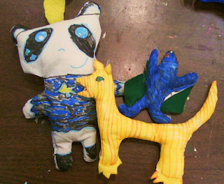
 CRITTER SOFTIES: Famously known as "the best class ever", Critter Softies is offered for 8-10 year-olds during the first week of camp from 9:30-12, Monday-Friday July 9-13. Kids get to design and create their own stuffed toys out of fabric and learn hand and machine-sewing (with my help). We'll make at least 2 creatures including a simple 2-sided design like above, and a more complex multi-limbed monster with movable parts. If time allows,we'll even make a short video to make our creatures come alive!
PAINTING & DRAWING: Held during the 2nd week for 11-13 year-olds, this class meets 9:30-12 Monday-Friday July 16-20. We'll start off with a day of group drawing games to break the ice and get familiar with lots of different materials. Then we'll move on to a mystery painting where each student will create a grid enlargement section in mixed media. Finally we'll use up all the results of our drawing games for a still life collage.

 SILKSCREEN: This class will be held the third week, July 23-27 for 12-16 year olds. Kids will be able to design, print, and embellish their own T-Shirts. HEY! I just checked the website and this class is full already!! sorry!
MURAL PAINTING: Held during mornings in the last week of Fleisher camp, July 30-Aug 3rd, this class for 14-18 year olds will allow teens to design and paint a brand new mural in our parking lot. We'll look at the traditions of mural painting and gather inspiration from neighborhood murals and street art!

There are lots more classes available for all ages- drawing and painting, photography, sculpture, and fiber arts. Check out the website for more information and to register for classes: http://www.fleisher.org/workshops/summer.php

And please spread the word!!!!

Get your creativity on! Summer classes available!

Summer is an excellent time to give yourself a creative vacation! Summer classes for adults at Fleisher include 6-week classes that meet once a week and one-week long intensives that meet 5 days in a row.

I'm offering both options this summer and the best thing is classes are truly affordable! Here's a sneak peak at some things you can learn with me:
SHIBORI DYEING: this 6-week long class will cover several techniques for resist-dyeing cloth inspired by Japanese traditions. Techniques will include binding, stitching, clamping, and pole-wrapping to get various marks on fabric.You can dye yardage, make motif fabric panels, or dye your own clothing such as scarves and shirts. If time allows we will also learn a few sashiko quilting patterns to combine our shibori-dyed fabrics into a functional or artistic quilt! This class meets Mondays from 6:30-9:30 pm. July 9th-Aug 13.

EXPERIMENTS WITH SELF-PORTRAITURE: this 6-week long class meets Wednesdays from 6:30-9:30 July 11-Aug 15. This mixed media class will explore many forms of self-portraiture, from traditional compositions to symbolic representations to help creative individuals learn more about themselves through art-making.  We will look through the lenses of family, history, emotion, and daily experience to express our perceptions of the self. Media may include drawing, painting (water-based media), and collage depending on your personal preferences.

STITCH AND SURFACE: this one week intensive meets Monday-Friday 10 am to 1 pm August 6th-10th. We will expand our stitch vocabulary with a doodle sampler, experiment with frottage for getting color/texture on fabric, and create an embroidered image with the theme of Memory/Memorial.

Registration is open online at http://www.fleisher.org/workshops/adults.php Sign up soon to ensure that classes will run! Invite a friend or relative to take a class with you!


Friday, May 25

"In a War"- Off to Denmark

I wish it were me off to Denmark, but instead it's some artwork. Here are 2 finished pieces for Hanne Bang's call for handkerchiefs embroidered with the text, "In a war, someone has to die". Mine is the black and white piece on the right, and one of my Stitch and Surface students, Anjeanette, prepared the one in green and white on the left:
 I don't personally know anyone who has died in war, but 5 of my family members have served in military forces in times of war. I'm awfully glad it was never their turn to be the "Someone".
 
 I love the "people" font I found for the word "Someone", for in the "S" is an adult reaching toward a child, in the "M" are two swordsmen fighting, in the "O" are another 2 men interacting, and in the "E" is a despondent seated figure. They were incredibly fiddly to stitch!
 Anjeanette used loosely satin-stitched block letters throughout, but placed them so perfectly in the negative space of the green handkerchief, that it creates great contrast to the soft floral.
 We've been working on a text piece in class, and one of the things discussed was how font, scale, and color can add meaning to whatever words are used.
Here are some links to some other individuals I've seen who are also participating:
and the project facebook page showing many more


Saturday, May 19

stitching community

I was very intrigued when I came across Danish artist, Hanne Bang's call for submissions for her project "In a War, Someone has to Die". I think I saw it on Mr Xstitch first, but I've seen several embroidery blogs mentioning it as well. Hanne asks for participants to submit a handkerchief with the project text stitched into it in one's own language. This project strikes a chord with me- its collaborative nature, its use of a personal piece of cloth, not to mention its representation of the human cost of wars- so many of which seem so unnecessary.
Here is my submission in progress:
The handkerchief is a very fine cotton with a drawn-thread border and white-on-white embroidery. I'm not sure if it belonged to my great aunt or great-grandmother, as I have a collection from several greats. Some of the text is in my natural cursive, but the words WAR and DIE were inspired by an alphabet in a Dover monogram book I have. The word SOMEONE will be in a 3rd style which uses posed figures to create the letters. The transfer marker was too bold for it, though, so I'll go back in after the rest is stitched. Since the fabric is so fine I'm trying to be careful with how the back looks as well- no hanging threads, knots, or jumps between letters. Most of it has been stitched in whipped backstitch and satin stitch with a few bullions on the serifs.
My Stitch and Surface students were assigned a "text" project, so this is simultaneously serving as an exemplar. I hope to get it in the mail to Denmark by the end of this week.

Tuesday, May 15

Thick like Honey

In my Saturday Silkscreen on Fabric class we're in the middle of my favorite process- printing monoprints with thickened dye (otherwise known as "deconstructed dye prints"). For my demo I found a piece of hexagonal tilework to coat with Havana Brown and pressed it into my clean screen, repeating until the pattern completely filled the screen. The brown dye was left to dry and harden in the mesh, creating a stencil.
 Once dry, I printed yellow thickened dye through the screen onto pre-soda-soaked cotton. Each of the 5 prints is different as the brown dye stencil slowly reactivates and breaks down the stencil. I like printing with just 2 colors (one for the stencil and one for printing), but more could be used. I love not having to worry about the dye drying out and blocking the screen, and cleanup is so easy!
It was so fun to have this honey-comb-like print and coloring in the demo, as the print paste is often compared to the consistency of honey. Last semester I mixed it too thin, but I've got it right now!

This fabric is destined for a piece I plan on making for the B Square gallery "Insect Invitational" in the Fall. Just looking at it makes my fingers itchy for a needle and thread!

Friday, May 11

Culminating events

If I've been MIA it's mostly due to trying to work out logistics for hanging work in the Philadelphia School District Youth Art exhibit the past week. The show is HUGE, spanning 3 floors of the building's atrium plus a few hallways and lobby areas. Every art teacher in the school district is allowed to submit about 5 pieces of their best student work- overwhelmingly 2D work as there's very limited space for sculptural installations. The district allowed the residency program I'm working in to install work as well, so while I was there I took a look around to see if I could find any fabulous projects.
I've seen this show almost every year for the past 5 years or so, so I've become familiar with the range of work- after a while it becomes obvious that some teachers have their favorite projects, and others have jumped on the Pinterest bandwagon. My eye was tuned to elementary level work, since that's the age group I've been working with most, and most of the high school work was just good observational drawing or portraiture. But here are a few that caught my eye:
 I loved this combination of hieroglyphics and self-portrait-as-Pharaoh silhouette layered on top. It definitely shows a serious sequencing and layering of learning activities.
 Fellow teaching artist Ben Volta had two of these Chuck Close-inspired grid enlargement portrait collaborations on display. The kids each produced a strip of the portrait using a lot of color, texture, and shape exploration.
 Once again, the yarn paintings caught my eye. I snapped pictures of two other ones last year. I'm just amazed at the precision of the designs and craftsmanship in gluing everything down.
 There was something intriguing about these interior views done in black ink and watercolor. I couldn't tell if the kids were depicting their own interiors or reproducing magazine images. Considering how "designy" they are, I'm leaning toward magazine inspiration. Either way, the selection of interiors had interesting line qualities, compositions, and sweet color combinations.
Then there was this totally random thing that caught my eye. I think I like this because it reminds me of graffiti on a textured wall. It's tempera paint over black corrugated cardboard- the kind teachers use to cover bulletin boards. The surface texture is what makes these exciting. I'd love to see the lesson plan on this one.
Maybe that's the unifying theme of my selections this year- overall they make me wonder "how did the teacher teach that lesson?" I think these art teachers must be thinking like artists as they plan their lessons.
Congratulations to all the artists and art teachers! The young artists exhibit will be up for about another month, and is at the Philadelphia School District Building at 440 N. Broad St. With the amount of work on the walls in this show it's mind-boggling how much artwork is made by students every year all over the city!

In other news- congratulations to my fellow M.Ed grad students who walked in commencement ceremonies at Temple/Tyler today! I could have walked today, and didn't because I thought it would have felt like an anti-climactic afterthought (having finished in January). But I feel a twinge of regret today that I didn't don a cap and gown and walk with my classmates. At least I spent my day in a classroom teaching art and applying everything I learned over the past 2 years. It was definitely worth it.