I've been busy the past few weeks getting ready for the new school year- but things have been simmering in the studio too. Seems like text is making a comeback in my latest work. The stump piece I started out in Montana is getting text embroidered in from a poem one of the other participants wrote during our residency:
My latest postcards are all bound up and have graffiti inspired text:
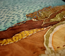
The photo transfer above resulted in a flipped image and backwards text. Since it was pretty indecipherable in the first place I decided to find my own letters and stitch over them. The piece below started off as a scrap sketch for the larger one I've been working on, so I finished it off with some bubbly text stating "BE".
Today I finished up a submission for an exhibit in Brooklyn at
Wayfarer's gallery. They came up with a text and gave each artist a word to translate into a work of art. My word was "LIFER".
It's ambiguous devoid of context. I used some leftover dye monoprinted cotton and started backstitching around the brick colored shapes to pick out the letters. I like how that made the "font" a little unpredictable. I continued the outlining around the edge to make a border, but the piece lacked color and energy. So I added some clusters of red french knots in the negative spaces. It helped define the letters a bit more, added texture, and created some movement across the text.
The word "Lifer" could refer to a life sentence in prison, or a career military person, or just to anyone who remains committed to someone or something for life. Till death do us part and all that. I hope my image is ambiguous enough to allow multiple interpretations. Are they cells and blood, an aerial view of city blocks, graffiti on brick? Are the red knots blood or a growth?
I'm curious what other kinds of interpretations and media people used. There will be around 250 artists!! I'm not sure if I'll be able to go up for the opening or not, but that will be November 9th if you're in the Brooklyn area. It's all bound and ready to ship!