Pages

Saturday, June 27

Textural Stitching


One of the reasons I don't do counted cross-stitch is because there is limited texture. The images are based on color differences following a grid and using usually only cross-stitch to fill and backstitch to outline. Boring.....


The piece here, "Brave", uses a combination of French knots and whipped running stitch in the red areas, covering the background with a pattern that allows the fabric to show through, and my "signature stitch" in the purple areas- a random cross-stitch which is great for color blending and dense coverage. This piece started with a printed fabric which I used for a more spontaneous way of working- responding to the existing pattern and colors rather than planning everything out ahead of time. This is sort of what my current stitch students are doing. We created a collaborative print and now they are responding to it. I'll get pics up when they're complete.


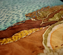
In freehand embroidery, one is not limited by the grid and you can create a much more dimensional and textured surface. Try building up areas of mark and color by stitching the same type of stitch densely over an area of fabric. Think of stitches as marks as important as brushstrokes in a painting or hatchmarks in a drawing.


Some artists play with density and allow the background fabric to play a part in the design. Check out Karin Birch's work: http://karinbirch.blogspot.com/ Here is her piece, "The Marriage". Her stitching echoes what is on the surface. Some areas are densely stitched or beaded, others use more line-drawing type stitches to allow the background to come through.
Karin Birch shows her work at Snyderman Gallery in Philadelphia and it's worth stopping by to see it if you're in Old City.
It's possible to completely cover your background fabric with stitched texture. Take a look at the work of Renie Breskin Adams on this link:
OF course, the more stitching, the longer it takes to complete. This is why I've developed ways of printing or painting on my background fabrics, or using a variety of appliqued fabrics so that I can make more pieces and not kill myself working on a single image for months on end.

Thursday, June 25

Summer in the City


Today finally feels like summer. It's not blazing yet, but the windows are open and the fans are on. Lots of galleries go on hiatus during the summer months, thinking everyone will be out of town. Maybe with the economy, though, more people will be sticking around feeling sticky.

I recommend a trip to Northern Liberties! Go to Projects Gallery on 2nd Street to see the "Summer in the City" show and check out this sweet and sticky piece by Aubrie Costello, which epitomizes what we see every day out here on the Philly streets in the heat.

The top declares "Juicy as Shit" and the bottom comments "Ya man. He shouldn't let you out the house alone". I'm amused by the placement of the blooms, covering up the areas we see waaaaaaaaaaay too much of this time of year.
Aubrie is a member of the Other Woman
Collective and a Moore Alum. Check out her links: http://www.aubriecostello.com/aubrie_costello/
There's a lot of other good work in the exhibit-- some more typical cityscapes, etc. But I think this one steals the show. If it's too steamy for you, go cool off at Rita's a block away and complete the summer in Philadelphia experience.
http://www.projectsgallery.com/currentshow.html

Wednesday, June 24

Crossing the Color Wheel

So here's a quiz.......... What do the following images have in common? Giorgio Morandi Still Life 1960
Tulle painting by Irfan Onurmen (sorry-don't know the title)

Georgia O'Keefe's Two Calla Lilies on Pink


Josef Albers' Homage to the Square
Give up? All 4 images have a calm, subdued, neutral color harmony, and I'm willing to bet that most of those neutral tones were created through mixing complementary colors. Complementary colors are opposite each other on the color wheel, and if used in equal quantities at their brightest chroma can be quite jarring to the eye. However, when they are mixed together they can create really beautiful neutral tones, more interesting than grays mixed from black and white. All those neutral areas in the paintings make those few moments of brighter color really sing.
This week's color theory class was all about complementary mixing. We made gradations across complements and then created value scales for each mixture in the gradation. By creating a mixing grid first, students already had all the necessary colors out to create a complementary color harmony still-life painting. I liked how this allowed them to spend more time in the right-brain painting phase instead of constantly switching to left-brain mixing phase. I have Betty Edwards' Color book to thank for this idea about right-brain vs left-brain artmaking.


Monday, June 22

Jouer!

In light of the previous post. Here's a stitch animation. "Jouer" means "play"!

Facing the blank canvas

Sometimes I think it's really ridiculous how scared I can get when starting a new project. I build up an idea of what something is supposed to look like, which sets up potential for failure. What if I can't make what I envision?!?

Probably most artists deal with the fear of the blank canvas or blank page. It's all that empty space facing you, needing to be filled. It's like running down a track and having to face a hurdle- you run up to it, ready to jump, then all of a sudden chicken out and put your hands up to stop yourself! In order to coax myself past that fear, I have lots of tricks to keep myself "running and jumping":


  • Make art everyday. Even if it's just a sketch, or putting together possible materials for a project, keeping your hand in the process keeps your creativity flowing and fears at bay. Try setting aside even half an hour to work every day. If you want to make art, make time for it.
  • Be more concerned about PROCESS than PRODUCT. When I worry too much about how it looks I get blocked. Focusing on the process, turning it into a sort of meditation, erases worries about "mistakes".
  • There's no such things as "mistakes" in art- just serendipitous occurrences that offer new possibilities for the work.
  • Do practice runs- sketches help plot out the work, getting it out of your head and into some more tangible form. Making decisions on cheap paper can save you a lot of time and money/supplies.
  • Photocopy works in progress, and doodle on the photocopy to plot out your next decisions
  • Break the blankness before you with a wash of color, or build an image off a drawing or print you made before.
  • Be Brave!

Friday, June 19

Stitch class collaborative print


This sampler was a lot of fun! Here are some of the stitches used: running, double running, backstitch, whipped backstitch, scroll, chain, cretan, cable, scallop, fly, buttonhole, fan buttonhole, french knots, and eyelets. Doing these really frees up the imagination. I often get stuck in the "importance" of the work in the studio. So these are helpful, more spontaneous, and playful.

This week in Stitch and Surface we made a collaborative screenprint.

Each student was given a piece of contact paper to cut into a motif. The motifs were placed on a clean silkscreen frame in the composition seen above. I scoop-coated the screen, let it dry, peeled off the contact paper motifs, and then everyone had a chance to pull their own screenprint on fabric they brought. I thought it would be fun to see what everyone would come up with if they started from the same image.
We photocopied the image so students could sketch out what they'd like to stitch on top. I'll have more photos of their results later.
Someone said the image reminded her of Matisse's papercuts. I think these would be interesting with more layered stitched motifs in bright colors!

Tuesday, June 16

The Warms and Cools of mixing Color

If there are 3 primaries, why don't we just buy 3 tubes of paint to mix with? This is the question I often receive in color theory. The problem with paint is that it isn't the same as light. It's impure. It would be wonderful if we could have paint the color of butterfly wings or peacock feathers, beautiful, ethereal, ephemeral things. But we're stuck with what comes out of the earth or what is created in a chemical lab. Our paint is colorful mud. And the more it's mixed together, the muddier it gets.


Light comes down from the sun or a light source, and the rays of light stike a surface; some of the colored rays are absorbed into the surface, and the others are reflected back. The color of the reflected light rays determines what we see. Each paint pigment has different absorption and reflectant properties. When you mix two paints together their absorption characteristics are combined and less light is reflected back. This is why mixtures are always duller than their parent colors. The brightest colors are those that come straight out of the tube. Mixed secondaries and tertiaries will never be as bright as a pigment secondary or tertiary. So if you need to paint a lot of green, orange, or purple- go buy a tube of paint!


This week my students created grids of color mixtures. The dots along the edge represent each warm and cool primary, with additional rows for white, black, and burnt umber. It's interesting to see how varied their results were depending on which order they placed their colors, and how balanced their mixtures were. It is plain to see that different starting pigments create vastly different results. Some of the individual squares are brighter than others. Some are extremely "muddy" looking.


Sometimes you want a duller color! Instead of dulling down a bright paint by mixing in the complement, you can start off your mixture by using the pigments that are farther apart on the color wheel.

The image below shows 2 attempts to match a color chip. It's harder than you think! Hopefully this practice in color mixing will help make painting a canvas easier- you can spend less time deciding how to mix the paint and more time actually painting when you get familiar with the possibilities of your pigments.

"Personal Boundaries"


Sunday's Art adventure continued on to South Street at Sage Projects, a new venture by artists David Foss and Rob Solomon. This month's show "Personal Boundaries" is one of the best group shows I've seen in a very long time. Of course I am extremely biased because there are several fiber-based and map-centric works and several friends of mine in this show. Even if some of my favorite people were not involved, I would STILL feel that this group show does a stellar job of bringing artists of different media together for a visual dialogue.

Emily Erb's painted silk maps are jaw-droppingly precise and elegant. I couldn't resist getting a detail shot of my neighborhood from PTC Map of Philadelphia. What is it about maps that I love so? Playing navigator on childhood vacations perhaps. Never completing an evening meal without the globe coming down off the shelf to aid discussion. Having a drawing or picture mean something in the wider world perhaps. These remind me of William Kentridge's tapestries at the PMA last year.


Shannon Donovan hides the map in grids and compass points, elevating the grittiness of things found on city streets to be ready for high tea. Chintz Hubcab uses the imprint of crocheted doilies in the clay, floral decals, and feminine color scheme to make me see coasters and my grandmother's deviled egg plate. This reminds me of how everyone I know from the suburbs prays I'll be safe in the big bad city. Shannon playfully gussies up the grit so even the DAR ladies couldn't complain.


Shannon also wins the prize for creative doily use. In 100 W's she shifts from doily impressions to doily resist, using the crocheted pieces as stencils for a more painterly effect. Each square in the grid is a cast of a water line cap, each one placed like a city block. The overall impression is red-hot, sultry like summer days, our water wasted by people opening up the hydrants because our pools were closed, our houses burnt down. The concentration of the doily prints reminds me of distribution of city demographics.
There are a lot more great pieces in the show, including work by Jessica Julius, Rebecca Kelly, Carol McHarg, Juri Kim-Oliva, Emma Saloman, Kathryn Pannepacker, and Carol Taylor-Kearney. Sage projects is at 333 South St and the show is up till July 12th.

Sunday in the Dark with....John and Carolyn

Just North of the Tacony-Palmyra Bridge lies a compound of buildings I've passed countless times, unaware of the history and possibilities of what was hidden within the unassuming facades. Welcome to Hidden City http://www.hiddencityphila.org/
There's a certain synchronicity that ebbs and flows in my life and my work. I seem to see exactly what I need to see, or find the exact book I need, or speak to the exact person I need right at the moment I need them in order to continue the flow of my thought processes and inspiration. I felt it the moment I entered Disston Saw works to see the work of John Phillips and Carolyn Healy. John had created a video montage of blueprints and maps and mechanical drawings projected over a screen of blueprints. The images and ideas fed directly into my brainstorm for what to do with my Woodford project (see previous post).
The space was dimly illuminated shrouding all in a certain mystery of sound and flickering light from John's video projections. The photo above shows Carolyn's series of rollers mounting upwards toward the ceiling and draped in silver silk. It caught the light, shimmered, and undulated like mercury. Some elements were harder to capture. The image above consisted of plexiglass box forms arranged under a series of hanging screens made of woven metal lattice onto which was cast a constantly shifting projection of blue- documents? The light made the entire construction feel ephemeral despite it's weighty materials. This was the piece in which it was most difficult to decipher where one artist's ideas stopped and the other's began.
These rusty boxes and saw blades seen above were stacked and arranged like a metal forest, or perhaps a futuristic yet abandoned city. A ziggurat. They shifted in the dimness, causing trepidation when trying to navigate the space.
I am fascinated by how an artist can take seemingly ordinary materials and spaces and make them extraordinary. The two artists were permitted to sort through the "archives" of the company, and found scads of original drawings and sample forms and source material. Their exploration ranges from formal arrangements of the detritus of years to historical references of the building and neighborhood to an echoing of sound and action and form of ongoing processes that occur onsite. John Phillips and Carolyn Healy honored the workers of this place both past and present by showing us the beauty of the materials they work with, and they helped us see the mystery of the rituals of their work and craftmanship.
Most of the Hidden City sites are open to the public on the weekends through June. Get out there before you miss your chance!


Friday, June 12

Stitching some Surfaces

This week began a new journey for 12, count-em, 12 Stitch and Surface students at Fleisher! I am pleased and honored that so many people want to learn embroidery. I always worry about the first class, as I'm not sure if I go over people's heads with too much at once, or if they already have a handle on basics and will be bored. Based on the questions and production of this group on the first class, it seemed just about right!
I like to start off stitch classes with the idea of a sampler. Our great-great grandmothers all started off learning not only stitching, but even their ABC's and 1,2,3's with a needle in hand. However, if you wanted to make a sampler like theirs, you would have gone to a cross-stitch shop and picked up a kit. I abhor kits- make something from yourself! Most samplers have the common elements of a border, some words or letters, and an image. Within those loose guidelines is a lot of room for creativity. Seen above is a sampler that started off as a demo on Lazy Daisy stitches (see the orange blossom in the center?). It then grew and grew as I played with different stitches and textures, adding words that felt right with the image as I went along.

Samplers are for you. They're for learning and referring back to. Mistakes are part of the process. I saw a reproduction of a sampler by Emily Dickinson today, and half the alphabet was incomplete and some of the words in her proverb were squeezed in smaller than the rest to fit. When I'm making a "sampler" I feel very free. I have no preconceptions for it. It's totally outside of my regular train of artistic thought. It exercises my fingers but doesn't tax my mind. Like doing scales on a piano.
This was a Wordle I created on http://www.wordle.net/ using words from my blogpost. It's called "doodlestitching". It would make a great sampler.........

Wordle: doodlestitch

Wednesday, June 10

cityscapes and screenprints

From the Trenton Ave photo, I've done this set of 4 watercolor drawings. The top left has the full view, and the others are explorations in the textures. The greens were a bit frustrating as I'm nearly out of my favorite tablet of green watercolor paint.

Now that I've done the paintings and split the color photocopy into sections, I'm easing into fabric. I thought it would be great to have an element from the site worked into the final image. I went back to the site, picked some of the leaves off the weeds and used them for a screenprint. Screenprinter pros: please ignore my lack of formal repeat! This is all getting cut up anyway. I have a solid area printed in blue, and over top is printed a linear version in pale green. The linear motif is very subtle and barely visible from the photo.


Tuesday, June 9

color in 3 dimensions

Tonight began Summer session of Color theory at Fleisher Art Memorial! I'll have some tidbits and extra info to share after each class.

Above is an image of Goethe's color wheel c.1810. I know..... Goethe was a poet, writer, philosopher kind of guy not a famous artist, but modern artists use color in profound thanks to great theorists and scientists throughout history. Newton, Goethe, Chevreuil, Itten, Albers, and Munsell are the names that come up most often when talking about color theory.

Goethe's wheel shows 6 hues, namely the three primaries (red, blue, and yellow), and the three secondaries (orange, green, and purple). Our artist's Color wheel shows 6 tertiaries as well (red-orange, yellow-orange, yellow-green, blue-green, blue-violet, and red violet) for a total of 12 Hues around the color wheel. Color Wheels show each Hue at its purest, and only show one dimension of color.


Itten's Color Star takes it up a dimension, by not only showing the 12 hues but also showing Value gradations for each hue from light to dark. The color wheels I had students do in class were more like Itten's star. However we just took each hue up and down one step by mixing in white and black. In class we sorted color chips on a table and found it difficult to place neutral tones. The difficulty was due to working on a flat surface- color is 3-DIMENSIONAL

Here is an image of Philipp Runge's Color Spheres also c.1810. You have to imagine color as a globe. Each longitudinal section represents a hue or color family with all of the purest colors on the crust. Each latitudinal cross-section represents a step on a value scale, with white at the North Pole (think polar bears) and black at the South Pole (think penguins). A Slice across the equator would show the color wheel around the outer edge with colors becoming duller at the core. This is the view that illustrates Chroma! Any slice across a hemisphere will show how opposite colors mix together and become grey. They cancel each other out and lose chroma.


So, Hue, Value, and Chroma are the 3 dimensions, the 3 characteristics of color. If you have any collections at home, try organizing them by H,V,C. Perhaps its a stash of beads or fabrics. Maybe it's your sock drawer. Whatever it is, see if you can make smooth gradations of color, and you may find it easier to find things! Check out this link to see some bookshelves arranged chromatically: http://www.flickr.com/photos/santos/27538777/

Dresses and fish

Frankford Ave First Friday in June had some fantastic and then some fun fiber art sculpture. At Goldfish Gallery was Lesley Haas' delicate paper dress construction. The paper has the brittle texture and color one would expect from aged textile artifacts. The bodice was supported by a dress form, but I'm not sure how much structure lies beneath the shredded-newspaper skirt. On the night of the opening the crowd was filled with models wearing flirty cocktail dresses created by another artist in the show, but they felt garish and burlesque compared with the elegant form below- though even Haas dress is showing some "cleavage" with the loosely tied bodice!

Down the street at Highwire Gallery, the Northwest Artists Collective was on display with "Go Fishin". Melissa Maddonni Haims' hanging sculpture "The Ocean" seemed the most fitting to the theme. Her piece is entirely knitted in a variety of yarns. I find the flat ocean animals distracting compared to the wonderful colors and forms that create the water. I wonder what would happen if the animals were given the same depth and texture as the water...
I think both of the works above were featured in the Focus on Fiber show at Art in City Hall this past Spring. It's nice to see them in a different context.


Thursday, June 4

Little Berlin Collaborative

After 10 weeks of collaboration my team consisting of Tyler Kline, Ashley Limes, Nike Desis, and myself, installed our completed sculpture at Little Berlin Gallery. The gallery is on Montgomery and Front St near the Berks El Station in the Kensington section of Philadelphia. http://littleberlin.org/
The opening of Offerings, an 80 person/20 team collaboration, opens this First Friday, June 5th from 6-10 pm. Many performance pieces will be in action that night, so don't miss it!


Our piece consists of a wooden armature encrusted with 3-dimensional mylar "nodes". The drawings on the mylar in sharpie and acrylic grew out of a 2-week map-making exercise. The finished piece feels like an explosion of all our paths and emotions and experiences during the time we worked together. It is unlike anything the 4 of us would normally have made and yet it still contains a spark of each of our personalities and art practices.

It hangs and twists in the drafty rafters, every glance a different perspective.

Wednesday, June 3

Woodford Mansion

I've been invited to participate in an exhibit next Fall at City Hall that will include work that focuses on the historic houses of Fairmount Park. This is not the first time I've used a historic house as inspiration. Last year I had the honor of exhibiting an installation at The Physick House Museum in Society Hill with Landmarks Contemproary Projects. In preparing for that exhibit I did a lot of research on the house and the historic events surrrounding it and its inhabitants before creating the work. Check out the review on Artblog for the results: http://theartblog.org/2008/03/a-fab-fiber-four-the-first-stitch/


So today I went out to Woodford Mansion to take a tour of the house and get inspired. The mansion was built by William Coleman in 1756 as a one-story, 3 rooms + basement country house. Coleman was a friend and investor of Benjamin Franklin's prior to the revolution. The house changed hands and in 1771 David Franks, a wealthy loyalist triangle-trade merchant, built a second story and added a back wing for upper ballroom, grand staircase, and kitchen. After the Revolution, in 1793 Isaac Wharton became the owner, and the house stayed in the family until 1868 when the Fairmount Park Commission was formed and started buying up riverfront property in an effort to preserve Philadelphia's water resources. The house now holds the Naomi Wood collection of antiques, and each room in the house is set up to display items that reflect the various time periods and styles of its 3 main owners. Check out the website: http://www.woodfordmansion.org/index.php


The tour guide seemed to stress the English loyalist aspect of the house, calling Franklin a turncoat, and nearly taking offense when I called Franks a Tory! He also emphasized how the architecture of the house illustrates class divisions- the servant quarters and areas are all on a lower level than the family living quarters. I'm intrigued by all the dichotomies involved: loyalist ve Revolutionary, upper class vs lower class, country vs city life, etc. I have about 2 months to create something. I'll keep you posted.

Tuesday, June 2

Felt constructions


This evening in fiber sculpture we continued working with felt, and I demoed some different construction methods. I showed how to make a fiber armature by wrapping and sewing quilt batting into the desired form to felt over. I'd previously made some millefiori felt beads by layering different colored roving over a felt "snake" and then cutting it down into 1/2 inch beads. So we talked about stringing for jewelry and stacking concentric shapes for relief images. Then I demoed some sewing techniques for constructing stuffed forms. My mini Moby was made by cutting a simple fish shape out of a previously created flat felt sheet. Since I wanted a smooth seam I placed right sides together, sewed a running stitch around the outside edge with a 1/4 inch seam allowance. Stopping about 1 inch from the starting point, I flipped the form inside out (really outside out!), stuffed it with polyfil and used an invisible stitch slip to close the edges. Flippers and French knot eyes complete it. Since the felt has some "give" the stuffing make a more 3-dimensional form than you'd expect from a 2 piece flat pattern. Another way to stitch pieces together would be to use a blanket stitch or binding/satin stitch over the edge. This would create a ridged edge on the outside of the form- like wearing a sweater inside-out. Here's a good tutorial from future girl http://www.futuregirl.com/craft_blog/2007/09/tutorial-hand-sew-felt.aspx Haha! just realized I demoed the stitch in the wrong direction!
Had enough time to create a cobweb felt scarf as well. It only has 2 layers of roving, and it's very fine and flexible.

New Beginnings part 2


The photo shown before has been enlarged. After living with it for several days I decided to go back to the maps/components ideas, where the larger image is broken up into smaller sections and the divisions are representative of a street map. This site is on Trenton Ave just north of the York/Frankford intersection. Since Trenton Ave cuts diagonally, I used smaller squares moving across the composition from lower left to upper right. Now the main vertical is Frankford Ave, the lower horizontal is York, and the upper horizontal is Hagert. If these street names aren't familiar, they are all part of the border line between Fishtown and Kensington in Philadelphia.


I stopped by the site again today to collect some leaves, as I thought it would be interesting to incorporate a motif or object from the place I was trying to interpret. The spiky leaved plants in the foreground are now nearly waist high. The photo was taken about a month ago. This is what fascinates me-- that despite all our concrete and brick, nature completely takes over here. It's incredibly fecund. I battle all summer with Virginia Creeper and Morning Glory vines.


Since I'm still not quite ready to jump into fabric, I started a watercolor version. I'll wait till all 4 panels are complete before posting it. So here's a similar format drawing I did this week showing different kinds of graffiti. The left side shows a shot from Oxford and Germantown, where the graffiti has earned the title of "mural". I think the owner of the walled lot there must encourage it- not sure if they go so far as to commission it. The right hand image is a scrawl on a warehouse building near York and Almond. I'm enjoying the drawings. They are so much faster than embroidery! I'm calling them drawings rather than paintings, since they combine watercolor and watercolor pencil.

Monday, June 1

Collaborations

Being an artist can be a lonely path. You have to be able to live with yourself, your ideas, and your process as you work. So for those who dislike being a hermit- God created the collaboration.

We are social animals after all. Working collaboratively with other artists or communities breaks the isolation of the studio and allows new ideas to ferment. The challenge is letting go of absolute control over ownership of ideas and what is created. The joy is seeing what grows out of the shared process. I've worked in a lot of different types of collaborations. Mostly in a pair with artist Michelle Wilson http://rocinantepress.blogspot.com/

Here's an image of "Infinite Thread", our most recent collaboration. This accordion-fold book was made of hand-pulled paper made from silk recycled from an installation of mine, screenprint, and letterpress. This was the most in-depth collaboration we've ever done. It combined materials from both of our studios, text that we wrote together, imagery that we painted and collaged together, and every step of the process was completed side-by-side. (It's in an edition of 14 if you'd like to purchase a copy!). In creating this book with Michelle, I got to learn more about papermaking, letterpress, and bookbinding. I also was able to share in a true dialogue, as we brainstormed, edited, critiqued, problem-solved, and created. Few collaborations are ever this egalitarian.

I'm currently in a collaboration organized by Little Berlin Gallery. They invited 80 artists to form 20 groups of 4 with the instructions to collaborate but spend no more than $50 as a group. It was an effort to discover new artistic friendships, new resources, and new ways of working. In a group of 4 one has even less control over the process and product than in a group of 2. Luckily my 3 partners were flexible, creative kindred spirits. After settling on the idea of maps, all 4 of us spent 2 weeks making daily maps, marking our paths, ideas, or experiences for each day. Our maps became a source for abstract imagery as we transferred them to mylar. We traded mylar maps and then constructed 3 dimensional forms. Mine came out spherical as you can see here. Yesterday we met once more to build a wooden armature which we encrusted with the mylar forms. It's unlike anything I ever would have made by myself, yet it came out of our collective ideas and processes. It is evidence of our effect on each other. I don't have a photo yet, but you can come this Friday, June 5th at 6 pm for the opening of "Offerings" at Little Berlin, on Montgomery near the Berks El Station.
So what sparked this post? Seeing a link to this collaboration which involved 7000 fiber "leaves" submitted by people from 23 countries and 39 states. Check out the International Fiber Collaborative website where you can also see images of artist Jennifer Marsh's previous collaboration as well. http://www.internationalfibercollaborative.com/index.html